
Election websites need great headings, accordions, and clear navigation
Election websites need great headings, accordions, and clear navigation
Official election websites are an important part of the ecosystem for election information – both to support voters directly and to support local organizations that relay information to their communities. The better your website is, the more useful it is as a source of accurate information.
We’ve been asking voters to show us how they find information on election websites for over a decade at the Center for Civic Design. With all the changes in elections since 2020, we decided now was a good time to review our previous research and re-check our recommendations.
We kept our focus on county and township offices, starting with an analysis of the site content and design of 22 websites from smaller jurisdictions with a population of 80,000 to 130,000. We know these offices often have a small election staff with fewer resources for managing a website. Many of these election pages were embedded in a county government website rather than being a stand-alone website just for elections.
We then selected six websites (two each in three states) that represented different web design styles for usability testing with 11 voters. We asked voters to use two of the sites to find specific information, such as when elections took place, where to go to vote in person, and how to do things like register to vote or request a mail-in ballot.
Building on our earlier research, we discovered trends about what works well in election websites and what confused voters. A few quick changes can significantly help voters find the information they need. We hope these findings will be useful for your election website.
Clear headings help voters find the information they need
Think about the last time you searched for essential information on a website. How did you scan all the text to find what you were looking for? Most internet users scan for keywords.
A heading is usually designed to stand out on the page with larger text and distinctive color, making it easy to find. Making sure that page titles, headings, and navigation are clear and informative – such as “Elections/Voting” or “Early Voting” – makes it easier to navigate the website by using words voters were looking for.
Using the terms voters are familiar with is equally important. Many of the websites we looked at listed election information in the menu based on the title of the office that runs voting, which in many cases is “Clerk” or “Registrar” – two words voters aren’t familiar with. These menu items weren’t recognizable, and it took people longer to find the information they needed compared to websites where “Elections” or “Voting” were the words used in the top-level navigation.
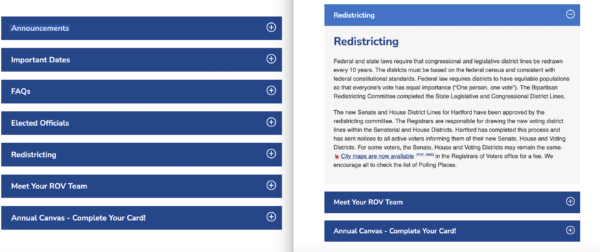
Accordions help voters find important information quickly
Accordions allow websites to organize information so that the main topics are visible, and voters can click for more info if they need it. This way, you can organize a long page by hiding sections of text until the user needs them. It’s also a great solution for small sites that have to fit everything on one page in a county portal. Accordions help prevent text overload by organizing information by topic and allowing users to scan for the information they need more easily.
When we compared the accordion style of displaying information with websites that simply included all the information with no visual hierarchy, it was clear that the first one was more user-friendly.
Make sure contact information is clear and easy to findWhen voters were stumped in finding the information they needed, we asked them, “Where do you turn to when you’re stuck?” The majority of people we interviewed said they would look for the contact information of the election office to reach out directly for answers. We saw how helpful it is when a website displayed its contact information prominently. Including contact information on every page in a consistent location (such as a footer like in the example below) will help ensure voters know where to turn when they want to ask a question.
Consistent fonts, style and color helped create a visual hierarchy that allowed users to quickly scan and find this information.
Let people know they’re leaving the website when they click on an external link
Many of the websites we looked at linked to external websites like the state election office. When this happened, users often became confused about the fact that they’d switched to an external website or were unaware that they were taken to a different website. We found in testing that users may have a difficult time making their way back to the original website when they were not aware they left it.
We recommend emphasizing in the link text that the voter is about to be taken to a new website. If the link opens to a file in a new window, we recommend including the file format (such as a PDF) in the text link.
For example, if the voter registration page is on an external website:
Don’t write:
Register to vote
Instead write:
Go to the STATE online voter registration form
Include voter information for students, voters with disabilities and other special circumstances
There are often special rules for students, voters with disabilities, military and overseas voters and about restoration of rights after a felony. When we asked test participants to find information about these topics they often could not find the answers on the website. In other cases, the information was written in a way that was too convoluted for the participants to understand.
We recommend:
- Creating a separate page for each issue
- Adding sections about each circumstance in topic pages (like a page on registering to vote)
- Including both options
Whatever you choose, make it easy to find the information through the menus and make sure the answers are written in plain language so that they are easy to understand.
Further Reading
Usability of County Election Websites, our research paper to the Human-Computer Interaction International 2013 conference.
Research Report: Voters in minority counties less likely to find answers on local election websites, Dana Chisnell
Vol. 05 Choosing how to communicate with voters, Center for Civic Design Field Guide
Vol .07 Designing election department websites, Center for Civic Design Field Guide
About the work
This article is based on a project from early 2023, which included website audits, feedback sessions with voters and conversations with election offices whose websites demonstrate best practices, led by usability researcher Asher Kolieboi.
This was originally published in our Civic Designing newsletter. Subscribe on Mailchimp to get election design tips delivered to your mailbox.
© 2025 Center for Civic Design