
Design and text can work together to make RCV election status and results clear
Design and text can work together to make RCV election status and results clear
Communicating election updates and results is not an easy task. Depending on the size of your jurisdiction, thousands – or even millions – of voters are going to be turning to your displays to find out about the status of the election and the final winner. But people have vastly different backgrounds, interpret information differently and have varying levels of English proficiency, and this will all impact how they interpret the result displays.
Voters have told us that, when it comes to election displays, they are often not sure if the results are final or are still being counted.
For Ranked Choice Voting elections, the multiple rounds of tabulation counting add another layer of complexity, and make it more confusing for voters to know when results are final.
With RCV, voters can select multiple candidates in their order of preference. The winner is determined in multiple rounds of counting. RCV election results displays have to communicate a lot of information, including:
- The status of the counting: preliminary, incomplete or final
- The current leader of the round-by-round counting
- What happened in each round
We recently published a best practice guide that covers everything we know (so far!) about what makes a great RCV election results display. While this research was focused on news articles, we think these best practices can apply to election offices as well. We’re excited to share two of our top tips with you.
Tip #1: To make it clear that results are complete, more indicators are better
We spoke to a lot of voters as we developed the best practice guide, and one of the most common questions that came up was how to know if the election results were final.
So what do you do? Do you simply write: “Final results” in large text in all caps on the display? Turns out that’s not enough because people don’t typically read a page in order, instead their eyes jump around.
To answer this question, let’s do an experiment. The following visual is an RCV election display showing the final results. Can you count how many indicators (visual or text cues) are used in this display to communicate the fact that this is the final election round?
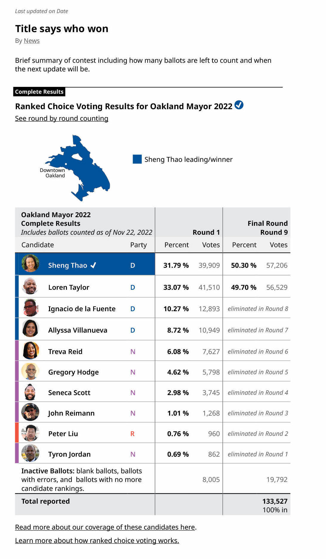
Did you count more than five? Because there are a total of nine indicators here that all communicate the same message: these are the final results.
Let’s break down everything that’s happening in this one image.
- Starting from the top, the title says “final results” (1).
- Next, there’s a label for completed results (2),
- A checkmark next to results.
- When we move on to the chart itself, it also states above the election round number that this is the “final round”.
- There is a checkmark next to the winner’s name.
- The winner is highlighted in a blue background.
- The bottom right-hand corner says the percent of results that are in is 100%.
- Under the election title, it states that these are the “complete results”.
And the final indicator?
- The winner has been moved to the top of the list. (Incomplete results had the candidates listed in the order they appeared on the ballot)
So there you have it. One image, nine indicators. They are all working together to make it very clear very quickly that these results are final. Each and every one of them is important on its own. Together, you get a display a voter can glance at – whether on their commute or while multitasking – and know right away: the election is over and here’s who won.

Tip #2: Providing context will help readers learn how RCV is counted in election displays
Voters see election results displays with fresh eyes and in different contexts. Plus, they have varying levels of familiarity with RCV, with the candidates and with the election in general. Some voters may have been closely following the race and others may be looking at an update in the middle.
People want their results to be “simple.” But they also want information to help them understand how and why the winner won.
So how do you create election update displays that are clear but also provide enough context?
Consistency between displays is important when it comes to RCV results, especially because of the way each contest is counted in rounds. For example, if a candidate gets eliminated from the race, you’ll want to keep their name in the following election display and include information about when they were eliminated. You’ll also want to keep the order of candidates consistent throughout the displays.
(The final round is the exception. Once all the ballots are counted, we recommend placing the winner at the top of the list.)

Readers need to know when candidates are eliminated and what happens to those votes. Keep all candidates in the display as the rounds progress. This helps provide context about the counting process. Supporters of a candidate want to know when they were eliminated and which other candidates they gave votes to.
Because RCV is a new way of voting, people want additional explaination about the election, the candidates and RCV in general. We recommend including links to resources to make them easier to find.
You can include links to:
- Round-by-round numbers with all candidates and all available rounds included
- Additional information about the candidates. For example, “Read more about our coverage of the candidates”
- Explanations of RCV. For example, “Learn more about how ranked choice voting works”
Including these links helps keep the visual display clean and easy to follow, limits the amount of text in the display, but also makes it easy for voters to learn more.

Even if your election office does not use ranked choice voting, we also think that many of the guidelines are relevant to election office results displays of all kinds.
There are several other RCV result displays best practices in our guide.
About the work
The projects mentioned in this article are based on research by Emma Werowinski and Fernando Sanchez.
This was originally published in our Civic Designing newsletter. Subscribe on Mailchimp to get election design tips delivered to your mailbox.
© 2025 Center for Civic Design