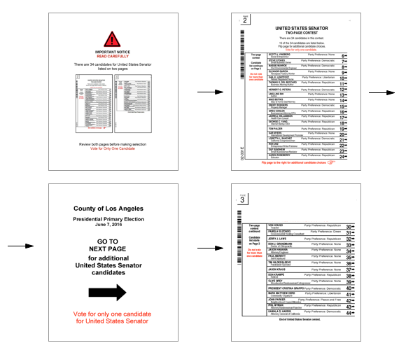
Breaking the ballot: 34 candidates for Senate
Breaking the ballot: 34 candidates for Senate
Today’s election design challenge is brought to you by the race for the U.S. Senate in California. With Barbara Boxer retiring, the open seat has attracted 34 candidates according to the list certified by the Secretary of State on April 1st. And that has county election officials in a quandary.
You see, ballot layouts are limited by the size of the ballot paper, laws dictating the order of the contests on the ballot and information that must be on the ballot, and the voting system technology, even before we get to a readable text size.
34 candidates for the Senate is a perfect storm of problems for ballot design:
- Contests are listed on the ballot starting from the President and working down through the hierarchy of government to local offices. Senate should come second on this primary ballot, right after President.
- The first page of the ballot also contains mandatory language about the election and instructions for how to vote. In California, there’s also information about how the “Top Two” primary works. This reduces the amount of space, so only about 20 candidates will fit in one column.
- Many counties in California have bilingual ballots, so each contest title and candidate information takes up even more space, further reducing the number of candidates that will fit on even a large ballot.
- Candidates are listed in random order, using a rotation pattern so voters in different places see the names in a different order.
And here’s the critical usability issue: splitting a contest into two columns is an invitation to overvote (voting for more candidates than allowed). That’s because voters are much more likely to choose one candidate from each column, and two choices are too many.
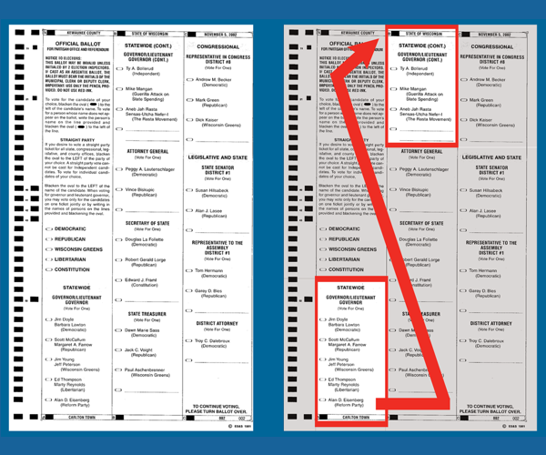
This is not just a theoretical concern. In an analysis of ballot design problems in real elections, the 2008 Brennan Center report, Better Ballots, said:
Just two years after the Palm Beach County ballot design debacle… “Kewaunee County, Wisconsin used a ballot that listed candidates for Governor in two different columns. The residual vote rate for the Governor’s race in Kewaunee County was nearly eleven times the rate in the rest of the state.” (page 22)
Design, test, repeat
California election officials have spent the last week scrambling to find a design solution that will work for voters, fit within the law, and work with their election systems. There are many different voting systems in California, with different technical capabilities, so the ballot layout will also have variations.
Putting the Senate on the front of the ballot means that the candidates are arranged in two columns, so our first approach was to try to use layout and instructional messages to make sure voters saw this unusual layout and did not vote for one candidate in each column. Voting for two candidates would be an overvote error, and would mean their vote did not count.
On Friday, April 1, the Center’s Nancy Frishberg and colleague Jayne Schurick joined Santa Cruz County Clerk Gail Pellerin to test three variations in the layout and messages on the first page of the ballot. We told voters that we had changed the instructions and wanted to make sure the new ones were clear. “Go ahead and show us how you’d vote this ballot.”
The results suggested that the two-column layout could be a disaster.
None of the two-column designs we tested worked: Over a third of the 29 people who tried the ballots overvoted by choosing a candidate in both of the columns.
- The bad news was evenly distributed: 3 of 9 voters trying the first two variations, and 4 of 11 trying the third variation made overvote errors.
- Most voters skipped the messages at the top and bottom of the first column, and simply chose a candidate in the first column.
- Only one person voted for a single candidate, in the second column. This informed voter was looking for a specific candidate’s name.
The idea that a third of the voters might make a mistake that would cause their vote to be thrown out was enough to send us back to the drawing board.
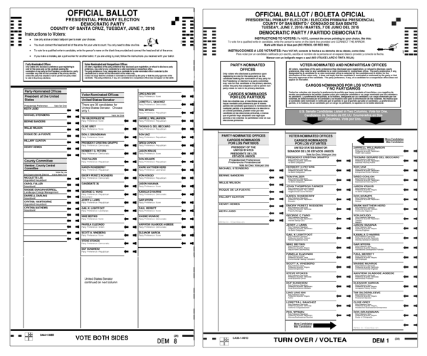
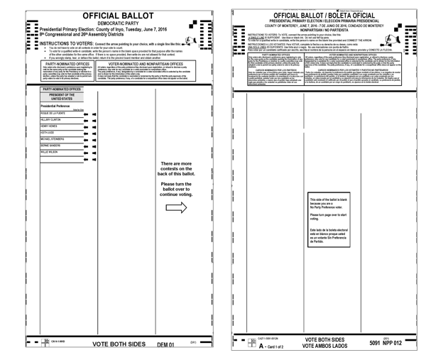
In Santa Cruz, Pellerin worked with their ballot designer on two design solutions to move the contest for Senate to the back of the ballot, where there is (just) enough room to fit all the candidates in one column. In the end, they decided to put only the President (and party committees) on the front of the ballot, and fit everything else on the back. This layout fits in Santa Cruz, but might not work in counties with more contests and local ballot measures, or who have bilingual ballots.
The challenge with this design is that voters who are not registered with a political party will see a blank ballot. Will they turn it over to find all of the contests? A message in the empty space on the first page directs voters to turn the ballot over to begin (or continue) voting.
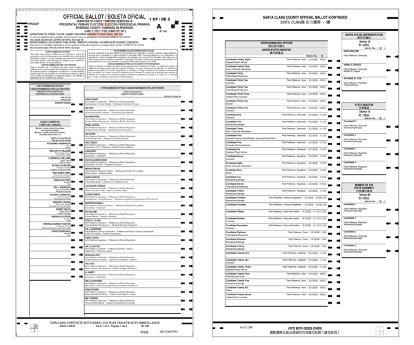
Around the state, other counties have also tried different designs, working within the technical limits of their voting systems, including:
- A stronger header on the front of the ballot that stretches across the two columns, with arrows showing the area where the candidates for Senate are listed.
- A double-wide column for the Senate so that even on a bilingual ballot, all the candidates fit in a single list.
- Listing the candidates for Senate in three columns as the only contest on one side of the ballot.
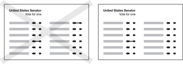
Illustrations showing the correct and incorrect way to vote.
Files with this illustration for several different types of ballots can be downloaded from the page of resources for voter guides.
More about the usability tests
Running a test like the one we did in Santa Cruz can be as easy as setting up a table in the main lobby of the county office building, where people are coming to do everyday business like paying taxes, getting building permits, or applying for a passport.
In just a few hours, we were able to watch 29 people including at least 3 who had never voted in a Presidential primary. We told them that we were checking the instructions on the ballot, and asked them to vote in any way they wanted.
If they voted in both columns of the Senate contest, we asked ““How many candidates for US Senate are there?” This often made them look at the ballot again to read the instructions. Unfortunately, when they realized they made a mistake, most tried to correct their double voting by crossing out one of their choices. This might have been an effect of the test context, but it also meant that they didn’t notice the instruction at the top of the page: “If you make a mistake, ask a poll worker for another ballot.”
We tried reduce concerns about whether these ballots might end up getting counted by using red or green pens (those colors can’t be read by the ballot tabulators), and printing the sample ballots on regular copy paper instead of the card stock for a real ballot
Decisions and deadlines
There are a lot of lessons to learn, but the most important from our perspective is that a little usability testing goes a long way. We’ve been excited to hear that other counties are also running usability tests with their own ballot layouts and their own voters.
Even the simplest of tests, put together in just a few days was enough to tell us that one possible ballot layout would likely be a problem. It pushed everyone to work together to find a better solution – one that won’t risk losing votes.
This is still a work in progress with deadlines for sending ballots to the printer looming. We’ll be back to post some of the different solutions as soon as sample ballots are available.
Examples of ballot designs
The illustrations from 2016 are not final ballots, but different layouts that counties tried as they worked to solve the problem and ensure that votes would be counted. Counties and their ballot designers went through many variations, looking for a solution that worked for voters and was technically correct for the tabulators to scan.
After the election
After the election, over 235,000 voters in California marked more than one candidate for Senate, so their vote was not counted. That was over 2.8% of the ballots cast overall. As a comparison, the Republican and Democratic party primaries accounted for only 5,833 overvotes or less than one-tenth of a percent.
According to an analysis by political scientists David Kimball and Martha Kropf, two factors made the biggest difference in how many ballots were spoiled:
- Splitting the contest into two or more columns. 33 of the 58 counties listed the candidate in more than one column. In those counties the overvote rate was 3.6% compared to 0.8% in counties with a single column.
- Not having a way for voters to check their ballot for errors. 24 counties count ballots at a central location, so voters don’t have the opportunity to see any errors reported by the scanning machines. In those counties, the overvote rate was 4.1%, compared to 1.1% in those with scanners at the polling place.
These effects are compounded when combined
- Single column ballots produced overvotes of 0.7% when counted in the precinct and 0.9% when counted centrally. Those numbers unfortunate, but might be expected in a contest with so many candidates.
- Multiple column ballots, however, produced much higher overvote rates, from a high 1.4% (precinct count) to a shockingly high 4.9% (central count)
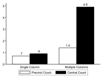
Overvote rates in the 2016 California Senate Primary by ballot format and counting system.
From Kimball & Kropf, 2017
This summary is drawn from:
- Our analysis of ballot design in the US Senate contest California 2016 Primary (pptx) looks at the ballots by the number of columns used for the Senate contest, and other layout issues, September 2016.
- Ballot Design Issues Lead to Almost 250,000 Over-Votes in California, June 2016 US Senate Election – Data report from YourVoterGuide.com, August 17, 2016
- Analysis of Overvotes in the 2016 California Senate Primary Election by David C. Kimball, University of Missouri-St. Louis and Martha Kropf, University of North Carolina-Charlotte, June 2017
- Our California 2016 Primary voter guide collection has examples of the ballots from all 58 counties.
More reading
The Selecting primary election ballots in California showcase has examples of how this process is explained to voters
Better Ballots is an analysis of design errors that affected how voters marked their ballots.
5 Comments
-
-
-
-
-
Questions to ask while designing a ballot | Center for civic design


