
Questions to ask while designing a ballot: A checklist for usable ballots
Questions to ask while designing a ballot: A checklist for usable ballots
Whether you are designing ballots for an election, working with a new voting system for the first time, or reviewing ballots, there’s nothing like a good checklist to make sure that voters can mark their ballots the way they intend.
This checklist presents 8 questions to ask when reviewing a ballot. These questions give a process for looking at a ballot and thinking about the voter experience for understanding, marking, and verifying their selections. The questions ask how all of the elements on the ballots come together to create an effective experience for voters.
A checklist for usable ballots
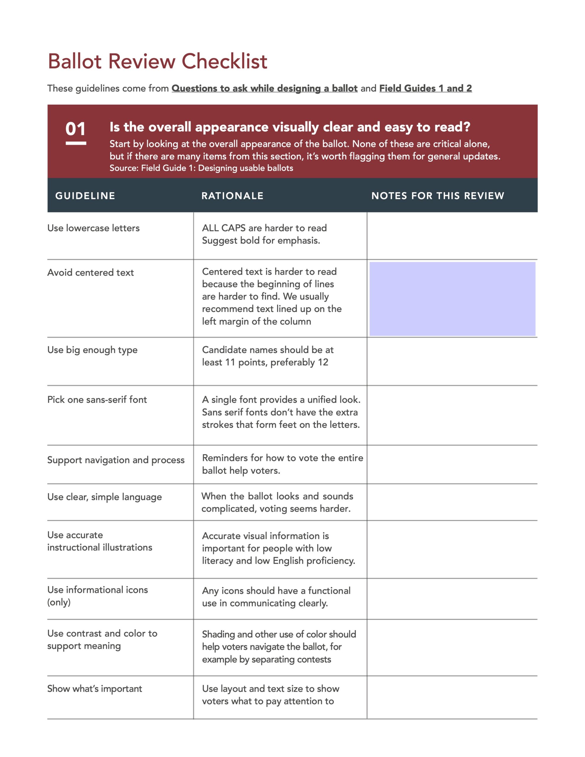
1. Is the overall appearance of the ballot visually clear and easy to read?
Start any review of a ballot by looking at the overall design. Are the names of the contests, the candidate names, and other elements designed so that it is easy to identify all the contests, see the candidates running for a contest, and read all of the information? Look at:
- Text size. Is all text large enough to be read, meeting VVSG requirements (at least 12 points)? Are the text sizes in a clear hierarchy of importance from largest to smallest?
- Formatting. Is bold text and shading used to make parts of the ballot stand out?
- Font. Is one sans-serif font, such as Arial or Univers, used for all text?
- Case. Is text in mixed case, rather than ALL CAPS?
- Alignment. Does all text start on the left margin (not centered)?
Why this matters: A well-designed ballot has a unified, consistent design that makes it easy for voters to see how the ballot is organized. Together, the design guidelines give the ballot structure and coherence.
2. Is the design consistent, avoiding bias, throughout the ballot?
Is the layout of the contests consistent, so that each contest and each candidate is presented in the same way? This includes:
- Marking options. Are they in a consistent place, in the same relationship to the candidates or ballot question choices?
- Spacing. Do all candidates in a contest have the same amount of vertical space?
- Marking targets. Does a hand-marked ballot use oval, round, or rounded squares instead of squares or connect-the-arrow to make a selection?
- Clutter. Does the ballot avoid extraneous information such as a candidate’s hometown or occupation, or uninformative party icons?
Why this matters: Even small changes in the visual space for a candidate or the placement of the mechanism to mark a selection can be confusing. Rounded marking targets are easier to fill in than squares, which invite checkmarks that do not fill the space and may not be counted by scanners.
3. Are contests clearly separated from each other, and from instructions?
The most serious problems we have seen on both paper and electronic ballots have come from designs that do not create a clear, continuous area for each contest. If the number of candidates, page or screen size, or other conditions make it impossible to meet these guidelines, conduct usability testing to be sure that the final design minimizes the impact.
If it’s impossible to meet these guidelines, plan voter education campaigns to help voters avoid skipping a contest or overvoting.
- Don’t split contests. List all candidates in a contest in a single column or on one (scrolled or paged) screen.
- Don’t leave blank spaces within a contest. If a candidate is withdrawn or disqualified, remove the entire row or column, not just the name.
- Don’t put two contests on the screen. For electronic ballots, put each contest on its own screen.
- Don’t put contests below instructions. On paper ballots, do not put a contest below instructions in the first column.
Why this matters: These ballot design errors – either splitting a contest into multiple parts or combining a contest with other information – have created some of the most serious problems in real elections.
4. Is the ballot easy to navigate?
Does the ballot help voters move through the process of making their selections? Does it have information and instructions placed where needed and in a visible location? Look for:
- Page numbers. Does each page of the ballot include a page number and the total number of pages?
- Icons. Are images or icons to support navigation used minimally, to call attention to important information?
- Clear instructions. Do navigation instructions use common, easily understood words?
- Placement of instructions. Are instructions placed where voters need them? (For example, instructions to turn over a paper ballot in the bottom-right, or how to write-in a candidate on the write-in screen of an electronic ballot.)
Why
this matters
A well-designed ballot has information to help voters navigate with information
placed where the voter needs it, presented in a visually distinct, consistent
way.
5. Do instructions have all the information needed to vote accurately?
Instructions on a ballot help prevent errors so voters can avoid casting a ballot that does not reflect their intent. Present information where the voter needs it on the ballot, in plain language, and avoid clutter in the presentation. Key information includes:
- How to start (for an electronic ballot marking interface)
- How to make and change a selection
- How many to vote for (Vote for 1, Vote for up to #)
- How to write in a candidate (and not to write in a name that is already on the ballot)
- How to get a new ballot if they make a mistake (or find an error on their printed ballot)
- How (and why) to check their ballot carefully before casting it.
Why this matters: Assume that voters have only the information on the ballot to complete the task of making their selections and casting their ballot accurately and confidently.
6. Are instructions written clearly?
All of the guidelines emphasize the importance of writing instructions in plain language and following best practices for instructions that can be easily followed. They should:
- Avoid jargon. Use simple, common words.
- Write positively. Tell voters what to do rather than what not to do.
- Write for action. Speak to voters directly, with active verbs.
- State the context first. Then, tell the voter what to do.
- Use numbers only for steps. If instructions are not a series of steps, use bullets or separate paragraphs.
- Use illustrations only to highlight the most important detail.
Why this matters: Voters may not read instructions carefully, so every word counts. Making them active and direct, and using simple illustrations, helps voters with low literacy, low English proficiency, or who are just reading quickly.
7. Does the ballot support language access requirements well?
Implementing language access requirements in a meaningful way requires a good process for the translations as well as good design of materials with more than one language. Electronic ballot interfaces can allow easy switching between languages, and the federal voting system standards (VVSG) require that voters have access to both supported languages and other settings at any time throughout the voting session.
On a paper ballot, however, language access means at least two languages on a ballot, making the layout more complex. Designing good ballots for language access includes:
- Translations. Is the translation accurate and appropriate for local dialect variations?
- Design. Is the second language easy to identify because it is typographically distinct from the primary language through the use of bolding or text size, within a single font for languages that share the English alphabet?
- Number of languages. Is the ballot limited to no more than two languages (or English plus one)? If not, is the layout clear so that each language is easy to find and recognize?
Why this matters: Poorly implemented language and accessibility features add to the burden of voters who already face extra barriers in voting. Poorly designed multi-lingual ballots affect all voters who use them.
8. Are ballot questions presented in legible, clear language?
Although the presentation of ballot questions is usually determined by law, is it still worth looking at whether they are well designed. Look for:
- Titles. Is there a memorable, meaningful short title for each measure?
- Summaries. Is there a short summary of the measure, rather than the full text of the bill or initiative?
- Line length. Is the line length for the measure between 40 and 60 characters, so it is easy to scan?
Why this matters: Voters complain about the length and complexity of ballot questions, especially in states where ballots often contain many measures of propositions. Election officials may have little control over the text on the ballot, but can still present ballot questions in a clear way.
Bonus: Have you tested the ballot design?
Check your ballot after you are done. Remember that the person who designs the ballot is not the right person to check it.
- Review the ballot. Check it against the official certification lists to be sure every candidate and every question is on the ballot, spelled correctly, in the right order, on every ballot format.
- Review translations and audio. Have native speakers review alternate languages. Check the audio on the ballot marking device without any visual display. Listen for accuracy and clarity at all speeds.
- Usability test with voters. Have at least a few voters try using the ballot while you watch (but not while they’re voting for real, of course). Test with more voters if there were any usual design challenges.
Why this matters: Usability testing the ballot with people who aren’t election insiders is the best way to discover problems with instructions, possible mistakes navigating the ballot, or layouts that can fool voters.
If you have questions about a ballot design issue, we’d love to help with a quick review and recommendations. Or to help you learn how to test your ballots for usability.
Download a printable view of this checklist (PDF)
Resources
There are many resources and ballot design checklists. These are some of our favorites.
- Field Guide Vol. 01: Designing usable ballots
- Field Guide Vol 02: Writing instructions voters can understand
- Field Guide Vol 03: Testing ballots for usability
- A best practice ballot design checklist
- Defects by design: ballots that fool voters
- Usability testing kit
- Designing Polling Place Materials – Election Assistance Commission
- Ballot Building (Chapter 5 – Election Management Guidelines) – EAC
- Better Ballots – The Brennan Center (2008)
- Better Design, Better Elections – The Brennan Center (2012)
- How a badly designed ballot might have swayed the election in Florida – Washington Post, 2018
- Designing a Better Ballot – The Atlantic, 2016
- Breaking the ballot: 34 candidates for Senate
- Don’t legislate ballot design
© 2025 Center for Civic Design