
Typography makes ballots easy to read
Typography makes ballots easy to read
Way back in 2000, the election director in Palm Beach County wanted to make the text on the ballot larger so the older voters in the county would be able to read it more easily. That decision kicked off national attention to the design of ballots.
Since then, we’ve learned just how hard it is to create a perfectly designed ballot. Long lists of candidates, legal requirements, and the ballot layout tools that are part of the election management systems all add up to a heady soup of constraints.
Understanding how to use typography – designing the text to make written language readable, legible, and appealing – can help you make good decisions about ballot layout.
Making ballots easy to read
Ballot design is a minimalist art – doing more with less. Drew Davies, the brilliant leader of our design partner Oxide Design, says that civic design has to focus on presenting information in a clear, uncluttered way. There’s no room for curlicues and other decoration on a ballot. Leaving off visual embellishments means that all of the attention is focused on the job: presenting voters with the candidates running for election, so they can make their selections as they intend.
Make the text large enough to read comfortably
No one wants to squint to read the ballot, so the most important guidance is to make the text larger. This isn’t just a problem in elections. Have you noticed that text has gotten larger on the web, too, as designers realize that people reading in all kinds of light and on small screens need it bigger.
We have the same advice for ballots. (We get that there are implications for layout. See more on that, below.)
For comfortable reading, make the text at least 12 points for printed ballots.
We know that fitting in larger text can be a challenge. And that this is larger than the current federal standard of 3.0-40 mm (or 8.5-11 points). But we’ve learned from research with ballots and other election forms that the Voluntary Voting System Guidelines VVSG 1.1 left a gap between the small and large sizes that is exactly where the best reading size for most people falls.
On-screen, the text should start even larger – 14 points – with options for voters to make it a little smaller (down to 10 points) or larger (up to 25 points), so they can choose the size that’s most comfortable for them.
Use layout and typography to show what’s important
Everything else about the ballot design helps voters understand the the information on the ballot:
- Use text size to create a visual hierarchy. Contest headers should be larger than the list of candidates. The candidate names should be larger than the party affiliation or other information about the candidate.
- Start each line on the left margin. Left-aligned text is easier to read than centered text because the eye doesn’t have to hunt for the start of the line.
- Use a normal mix of lowercase and capital letters, not ALL CAPITALS. It makes the shape of the word easier to recognize. And it doesn’t look like you’re shouting. (If the election code requires all capital letters, make it your 2019 resolution to get that changed.)
- Put messages and instructions where they are needed. Instructions for voting at the top or in the left column; navigation instructions right after the last contest on the page.
Choose an easy-to-read font
- Use a sans-serif font. These are fonts without the little extension lines or flourishes at the end of the strokes. They are easier to read on a screen and easier for people with dyslexia or whose primary language doesn’t use the English alphabet.
- Use just one font on the ballot. It makes the ballot look more tidy and unified. You can use bold for emphasis, and some fonts families have a good “narrow” font that makes it easier to fit longer names into tight ballot spaces.
Know your type terminology
Speaking of fonts, let’s clear up a confusion about some terminology about type.
Roman is the opposite of italics. Type families often have several variations on the basic letters, including most commonly:
- Roman: the vertical lines of the letters are straight up and down
- Italic: the vertical lines are on an angle
- Sans-serif is the opposite of serif.
There are four main groups of fonts, but only the first one should be used on ballot. Certainly not an ornamental or script. We’re inviting people to cast a ballot, not come to a wedding.
- Sans-serif
- Serif
- Ornamental
- Script
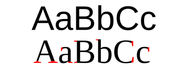
Image credit: https://en.wikipedia.org/wiki/Typeface
Why does this matter? Because if the election code specifies a “roman font” it just means one that isn’t on an angle, not that you have to use Times Roman. And “gothic” is just another (if old-fashioned) way to require a simple, undecorated font, not a specific font family like News Gothic.
(Thanks to our friend, Kammi Foote for inspiring us to write about these terms.)
Resources
- Field Guide 1: Designing usable ballots
- How to Use Layout and Visual Presentation in Voter Guides
One of the Voter Guide Best Practices Webinars, with a good introduction to typography by Drew Davies, the amazing designer behind our projects. - Ballot design and the intersection of constraints
- Answering voters’ questions: what’s on the ballot, and the mechanics of voting
- Showcase: Updated ballot standards for Virginia
- If you want to follow the work to update the VVSG’s usability and accessibility requirements, the Human Factors Public Working Group has a page with current progress and bi-weekly meetings.
This was originally published in our Civic Designing newsletter. Subscribe on Mailchimp to get election design tips delivered to your mailbox.
© 2025 Center for Civic Design