
Better design = more culturally responsive voter outreach
Better design = more culturally responsive voter outreach
We recently wrapped up a research project focused on how visual design can help create more culturally responsive voter materials. This research led to new insights about the relationship between trust and design, how layout, color and images can invite participation, and a lot more!
You can read the research report on our website along with a toolkit with practical instructions on how to apply these insights to your own voter materials. Our toolkit includes practical examples, guidance, and sample designs to help you use what we learned. While the toolkit is aimed at community groups, we think election officials will find these insights useful, too.
A behind-the-scenes look at our research
And if you think the findings are cool, the research method we used to get there was just as exciting. So today, we’re going to take you behind the scenes and show you what we did.
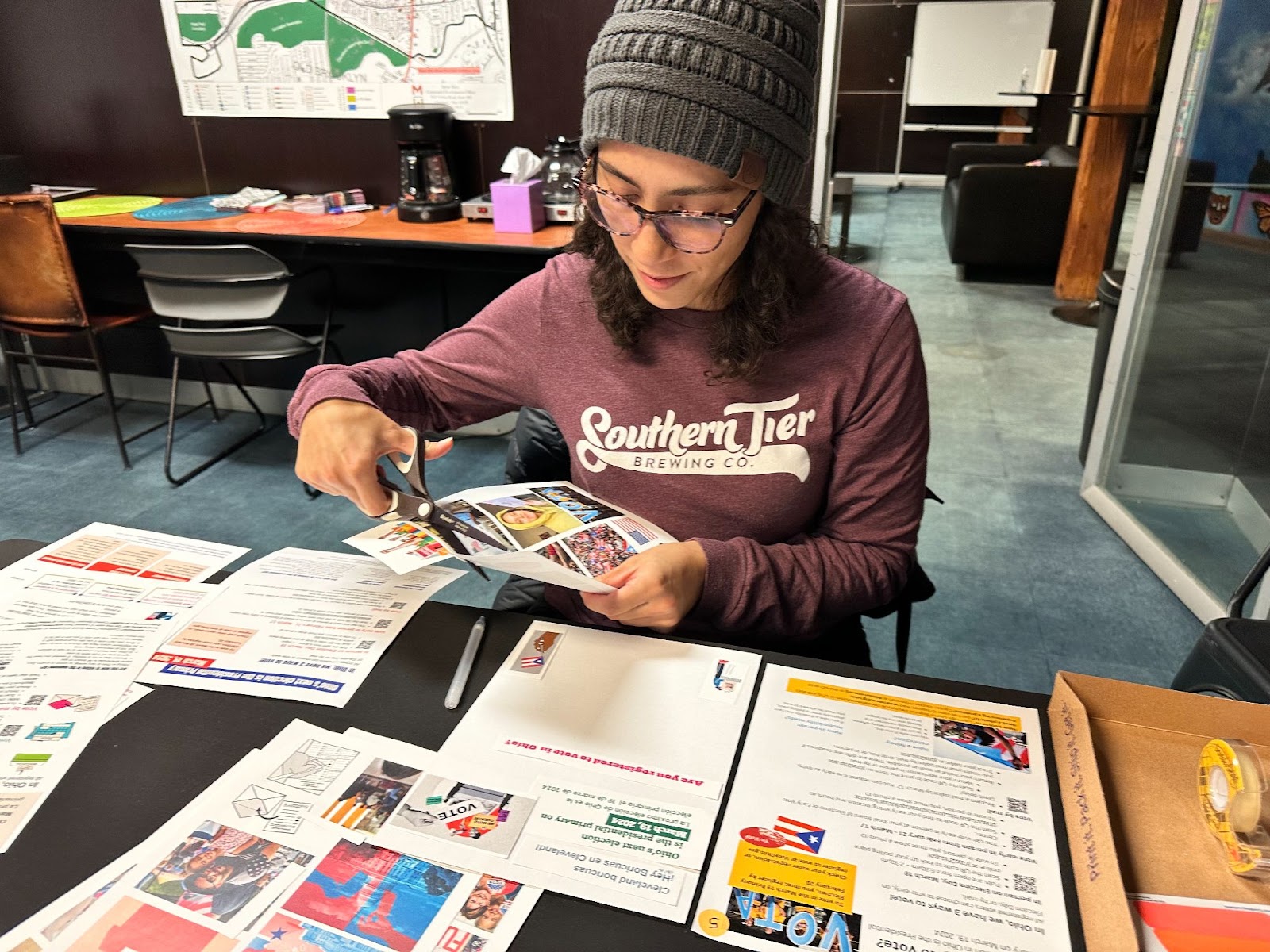
A research participant cutting out different visual elements to create the ideal flyer they would like to receive
Usually, in usability tests, we ask participants to do a specific activity (find information in a brochure or complete a form, for example), watch how they use it and then follow up with questions about their thoughts and feedback. But this research looked a little different. We chose a creative participatory research method for this project, which meant that instead of only asking participants their thoughts on voter outreach materials, we asked them to make their own.
To start, we dumped a bunch of arts and crafts supplies on the table and told them to let their imagination go wild. They had scissors, markers, glue, and most importantly, pages and pages of sample text and images.
It looked more like an art studio than a research interview, but that’s what sparked the magic. By getting messy, working with their hands and eventually laughing, participants opened up to us, and we got into rich conversations about nuances in color, imagery, messaging and tone.
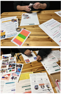
The sample text and images contained dozens of options because we wanted participants to choose what resonated with them. Some headlines were serious and others were playful. As researchers, we learned what the boundaries of “too silly” or “too serious” were by watching participants’ reactions to different headlines and images.
The sample kit given to participants included a range of colors and images with cultural significance. We explored a range of color palettes, including more traditional red, white, and blue and more playful and unconventional ones as a way to identify which one most resonates with the intended audience. We heard from some participants that they liked the messaging and text overall, but the non-traditional colors threw them off and looked too young and not “serious enough”.
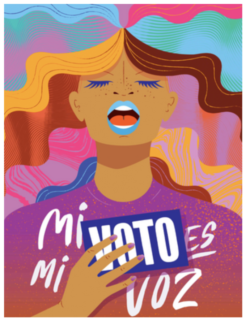
For example, here’s an image some participants said was too playful for election information:
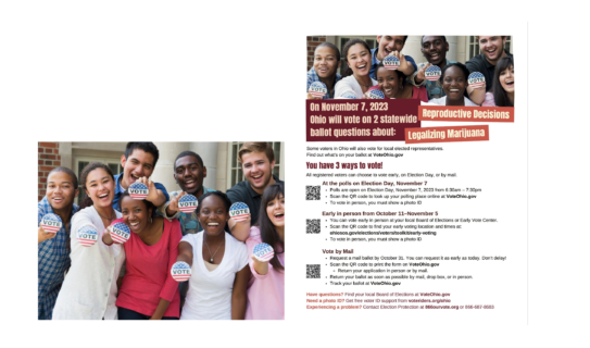
On the other hand, the image below received positive feedback from participants. “I see more of myself in these, most people in here look like me,” one participant said.
This particular image was also part of the top 3 preferred flyers from Nepali and English speaking participants.
From artroom to research insights
We chose this nontraditional method for a few reasons. As a participant, it can be intimidating to comment on the design of an existing flyer. If you’re not a graphic designer, it can be difficult to parse out what specifically you like about a poster and what you don’t. You might just “like it” or “dislike it” without knowing how to articulate exactly why.
But when you’re asked to create something of your own, you have to make choices. You choose the headings, text, images and colors. Watching this process gives us an opening to ask about choices, decisions and preferences. As researchers, this part of the conversation makes the insights deeper and richer. For us as researchers, all these decisions are incredibly valuable information.
Creating a flyer from scratch slows down the process from quick reactions and allows participants to think about each component separately. The hands-on activity also leads participants to be more honest with their thoughts and opinions. When someone creates something, they often feel more comfortable to share what they like and don’t like about it. Since it’s their own work, they also don’t have to worry about feeling cautious about critiquing someone else’s work.
Ready to get started?
- Read the research report
Learn more about the 14 design insights about designing materials that appeal to voters - Check out the toolkit based on this report
Get started creating more impactful voter education materials for your audience.
About this work
For this research, we worked with community centers in 3 cities in Ohio. We led a total of 61 in-person sessions in English, Spanish, and Nepali. The insights from these sessions and the research led to 14 insights on impactful design. The project team included Andrea Miranda Salas, Emma Werowinski, and Allyson Gill.
© 2025 Center for Civic Design