Rapid, responsive, radical: The Anywhere Ballot is born
Rapid, responsive, radical: The Anywhere Ballot is born
Maybe someday there won’t have to be separate accessible voting systems anymore.
With Drew Davies and Kathryn Summers, we’ve developed an accessible, device-independent ballot front end.
The idea came up at a workshop of the Accessible Voting Technology Initiative, a project sponsored by the Election Assistance Commission, about a year ago. The workshop, a virtual Noah’s Ark of people who care about accessibility in elections, was one of two held in Atlanta in which amazing people with brilliant ideas came together to answer the question, How might we make voting accessible for all voters?
One of the most intriguing ideas came in the form of a question: What if anyone could vote on any device? The thinking was that rather than having separate voting systems for people who did and didn’t have disabilities, voters could vote on a device they already had and knew and had customized and personalized.
Later, ITIF, one of the groups the EAC awarded with a grant to look at accessibility in voting awarded a sub-grant to our little band of designer-researchers. The University of Baltimore, where Kathryn Summers is an associate professor and works on usability and accessibility for people with low literacy, is our grant host.
In November 2012, we conducted rapid iterative testing with a paper prototype of a radically different design for a digital ballot. The bones of the ballot came from work done by the Design for Democracy Project of AIGA and research I did with Ginny Redish for NIST. In 4 days, we went through more than a dozen iterations and came out with something amazing.
Then, in January 2013, we went back to the UBalt usability testing lab, where we tested a digital prototype on an iPad. We had 15 participants, most of whom had reading, cognitive, or other intellectual disabilities. These were by far some of the most challenging sessions I’ve ever moderated. And the most fun. We watched people struggle in the early sessions and then succeed in the later sessions as we refined the design again.
There were some sparkling eureka moments — exactly the thing you hope will happen in a usability test.
You can see the iterations from the paper prototype in the slide show above. Try out the digital ballot for yourself on your own tablet-like device. Open a browser and go to anywhereballot.com. It’s not perfect, but we think it’s pretty good. Let us know what you think.
P.S. We owe special thanks to Megan McKeever, who was our “computer” in the first round of testing, and Noel Alton and Malcom Kemeny. All are wonderful students of Kathryn.
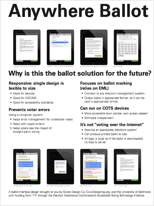
UPDATE: Here’s a poster. (Download as PDF)
Why is this the ballot solution for the future
Responsive: single design is flexible to size
- Good for devices
- Good for UOCAVA
- Good for accessibility standards
Prevents voter errors: Using a computer system…
- helps error management for under/over votes
- helps with typed write-in
- helps voters see the impact of straight party voting
Focuses on ballot marking (relies on EML)
- Connect to any election management system
- Output ballot in appropriate format, so it can be cast in appropriate format
Can run on COTS devices
- More accessible (own pointer, own screen reader)
- Software independent
It’s not “voting over the internet”
- Assume an appropriate ‘elections system’
- Can produce printed ballot to cast
- All logic is local, so if the ballot is downloaded, no trips to server
The poster shows eight screen shots:
- Introductory instructions on how to vote
- “Vote for 1” screen, with a candidate selected
- Contextual information screen on U.S. Senator
- Write-in screen
- Multiple-selection contest screen
- Pop-up alert screen to prevent over-voting
- Vote review screen
- Final confirmation screen
A ballot interface design brought to you by Oxide Design Co, CivicDesigning.org, and the University of Baltimore with funding from ITIF through the Election Assistance Commission’s Accessible Voting Technology Initiative
1 Comment
-
Hasta La Ideas » Blog Archive Micro, Meso, Macro: Exploring the Scale and Presence of Design through Physical Objects and Social Systems - Hasta La Ideas

