Put navigation instructions where voters need them
Put navigation instructions where voters need them
There’s only so long a ballot card can be before your scanners just can’t deal anymore. Turns out, that’s true for voters, too. So, you print on the back of the ballot card. Ever noticed a contest or two on the second side of the ballot where the undervote rate is high? (We have seen this in usability studies we’ve done.) It’s not always because those are down-ballot contests. Many voters don’t automatically check the second side of a ballot card. As we have seen in studies, even poll workers miss turning ballots over when they vote.
Where to put instructions to turn the ballot over
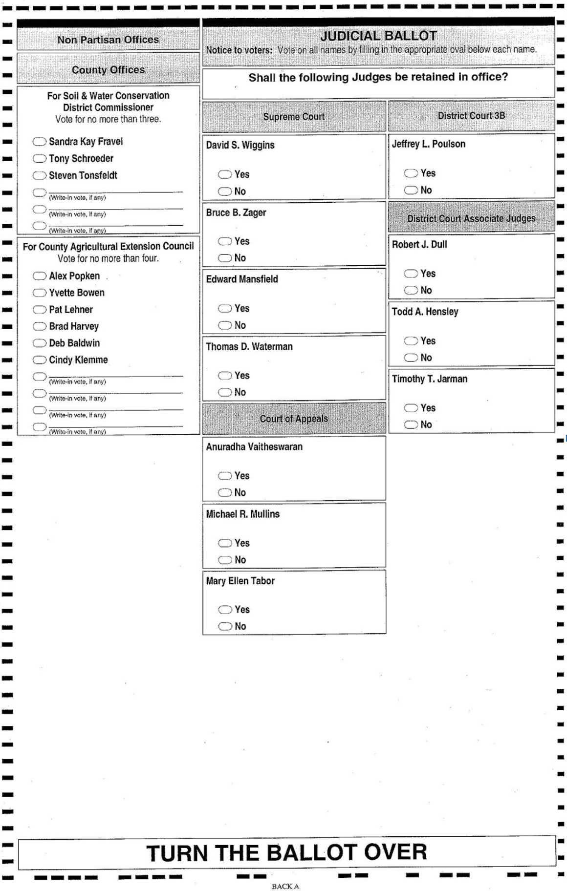
Many ballot layouts that have contests on both sides of a ballot card have a large, bold banner across the bottom of each card that says something like “turn the ballot over.”

These words typically appear at the bottom of the ballot, where they are easily lost in the timing marks and other “decoration” outside the boundary of the contests. Although the instruction seems like it’s in the right place — at the bottom, at the end of the contests — it’s not close enough to where voters need to see it. And, they are in (easy to ignore) upper case.

Where they are, what they look like, and what they say are designed to be ignored. If you’re a voter in a rush, those words are basically invisible.
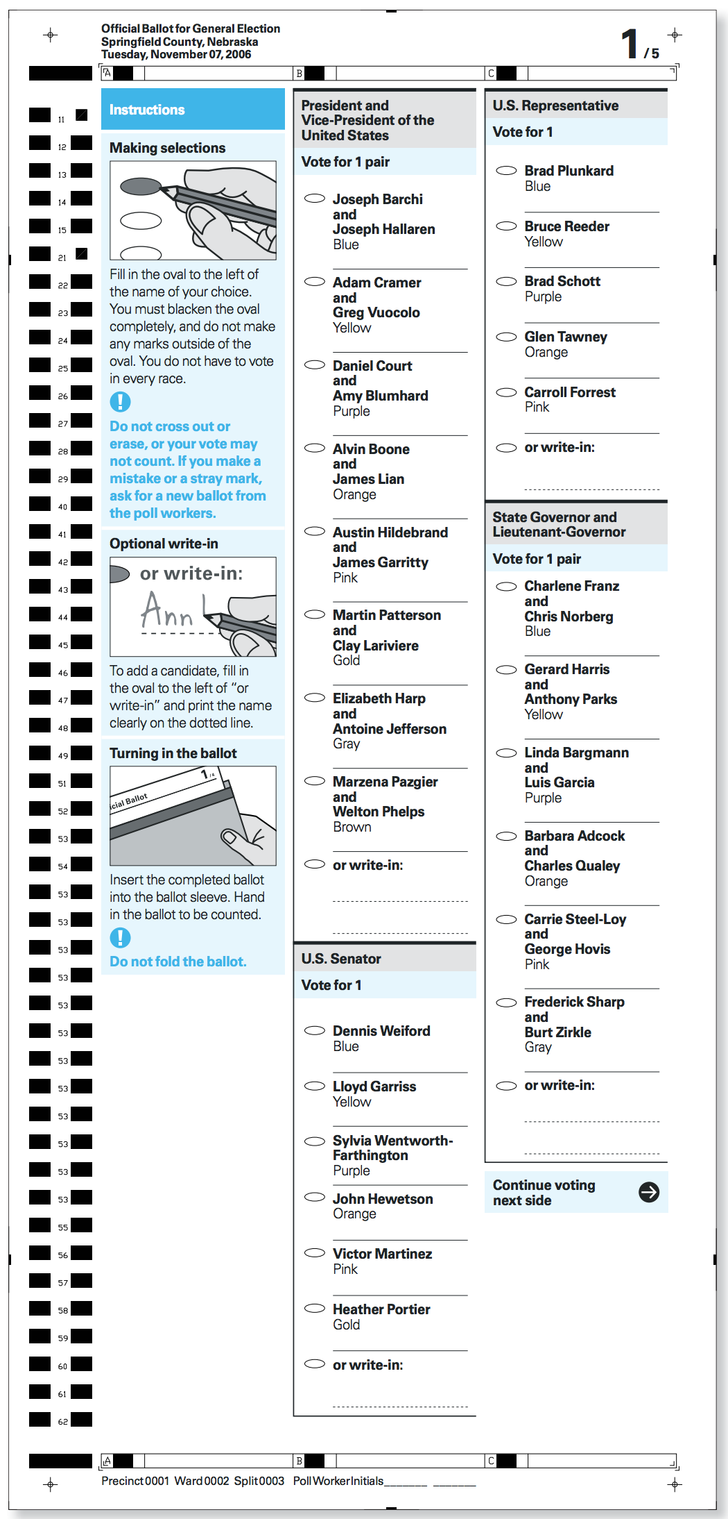
Instead, there’s a simple solution: Put instructions to turn the ballot over in the bottom right hand corner, at the end of the last contest.
When you do that, the instruction is close to where the voter needs it. Even on a long ballot, it’s positioned right where they need to know where to go next.
Every voting system that we know of can do this.

Don’t let ballot design fool voters into skipping votes
- On a 2-sided ballot card, put the instructions to turn the ballot over immediately under the last contest in the right-hand column.
- On multi-card ballots that are printed on both sides, include the instructions to turn the ballot over on every side of every card.
- Put the page number and the total number of pages at the top of each page as an extra clue.
Resources
- Field Guide To Ensuring Voter Intent, Vol. 01: Designing usable ballots
- Ballot design and the intersection of constraints
- Showcase: Updated ballot standards for Virginia
This was originally published in our Civic Designing newsletter. Subscribe on Mailchimp to get election design tips delivered to your mailbox.

