Don’t legislate ballot design (there’s a better way to improve ballots)
Don’t legislate ballot design (there’s a better way to improve ballots)
At the Center for Civic design, we spend a lot of time reading state election laws looking for the rules about ballot design. It makes us want to weep, because there are so many better ways to set clear ballot design standards that can be followed consistently and accurately.
No one wants to see problems like the ballot used in the 2018 midterm in Broward County. (If you are just now tuning in, the ballot layout put a U.S. Senate contest in a corner of the page, under the instructions, and many more voters did not vote in that contest than expected.) When ballot design is in the news, legislators in states from Florida to California start looking at their election code for ways to make sure it never happens again.
We get it. What self-respecting state legislator would not want to make sure that ballots help voters mark their ballots accurately?
We think there are other, better, ways to ensure voters can vote the way they intend than specifying ballot layout in laws.
What design rules in election code look like
Even if you are used to reading the arcane style of legislation, it is hard work picking your way through it.
As an example, here’s what the election code says in California about the candidate “designation.” (That means a description like “business owner” that gets printed below the name of nonpartisan local candidates.)
In all cases, the words so used shall be printed in 8-point roman uppercase and lowercase type except that, if the designation selected is so long that it would conflict with the space requirements of Sections 13207 and 13211, the elections official shall use a type size for the designation for each candidate for that office sufficiently smaller to meet these requirements.
This law doesn’t even support good design. It sets the size of the text at 8 points — below the 10 point minimum size in the federal guidelines in the Voluntary Voting System Guidelines (VVSG) 1.0 (and even further below the more readable size of 12 points). It allows candidate names to be even smaller: if one candidate chooses a long text, all of the candidates have the size of their descriptive “designation” reduced.
This short snippet of election code has some typography terms of art that can be misunderstood. For example, did you know that “roman” just means normal, vertical letters — the opposite of “italic” — not any specific font? (If you’d like to know more, you might find our article on ballot typography helpful.)

Roman type is simply vertical. Italic type is slanted.
One challenge of writing design rules like this is that it makes it hard to see how all the pieces fit together. The selection of election code we showed above has 2 cross-references to other parts of the code, so you have to do a lot of flipping around to understand the exception.
It’s easy to end up with conflicting requirements, or a rule that doesn’t fit into the overall ballot design well. As an example, let’s imagine that lots of voters didn’t notice an instruction — a change to prevent that from happening again seems like a good idea. So someone suggests making it larger, and maybe bold. In a later election, there’s an unusually large overvote in certain contests. Again, a change to the code seems like a solution. But, make enough of those changes, and pretty soon everything is bigger and the whole ballot just seems to be shouting. When the visual hierarchy is disrupted, it’s hard to see what’s most important. Voters don’t know what to pay attention to.
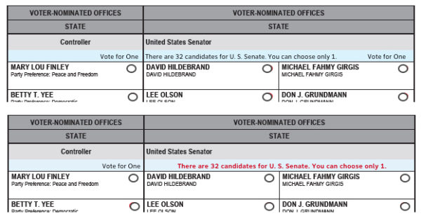
In the example below, election officials wanted to help voters see the boundaries of a contest split across with too many candidates to fit in one vertical column. One proposed solution was to make the instructions bold and red, but this could have unintended effects by emphasizing one instruction, effectively de-emphasizing others.

Test ballot layouts. Top: Ballot with a contest split across columns because there were too many candidates to fit in one vertical line. Bottom: Proposed legislation to emphasize instructions only in that contest.
When design is written into legislation piecemeal, there can unintended consequences. It also makes it easy to leave out an important design requirement because it seems obvious at the time. Issues we have seen in real elections have sometimes happened because they weren’t clearly spelled out in the state’s ballot standards — like not splitting a contest across two columns or rows. Or not starting the contests in the same column with instructions if that makes it hard to find the first contest.
The biggest risk might be the hardest to see: Every piece of election code is written for a context. No matter how much we try to make design rules independent of a specific type of voting system, assumptions and history almost always creep in. If election code is designed for an existing system that will be obsolete someday, new rules can get layered on over time, and that can generate more conflicts in the design of the ballot. That means the election code doesn’t work as well for new voting systems with different ways of presenting the ballot so voters can mark their choices. And it’s difficult to update code that was written in small pieces in different sections, over time.
Ballot standards: regulation instead of legislation
A better solution to ensuring that each state requires good design is to give that responsibility to ballot design standards. In this model, the law sets the requirements for what must be on a ballot and the regulation tells the counties how those elements must be presented on all styles of ballots. This isn’t a new approach: It’s the same approach used in federal accessibility Section 508 requirements, and any other situation where the law directs a government agency to create standards to support new legislation.
It’s not unusual for a state elections office to create some guidelines for the counties. New York, Ohio, and even Florida do it. A good set of ballot standards act not only as good reference to the election code, but also can be a useful tool to help with ballot layout for election administrators and vendors.
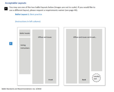
Virginia is a good example. In 2018, the Virginia State Board of Elections adopted new ballot standards, created with help from the Center for Civic Design. The updated requirements aimed to make it easier for both voters and elections officials, providing uniform ballot layouts that were easy to implement on all of the voting systems in use in the state.

Ballot layout page from the Virginia State Board of Elections Ballot Standard. The symbols show the source of each requirement.
Write good ballot standards
Writing good ballot standards takes care and attention to detail. The most important feature of Virginia’s ballot standards is that they bring together the requirements in Virginia’s election code, additional requirements from the state elections office, and best practice recommendations for every element on the ballot drawn from well-researched sources like the EAC’s best practices for Designing Polling Place Materials into a coherent, useful format.
Standards usually tell ballot designers what to do, but they also need to include a defensive position and cover what not to do. The EAC best practices say that “Vertical instruction treatments cannot share column space with contests — test voters often overlooked races located immediately beneath vertical instructions,” but this guidance appears in a general discussion, not in a clear, unambiguous checklist.
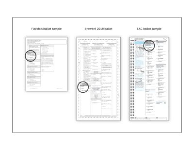
It’s also important to spell out assumptions that can affect the design and consider what happens if those assumptions change. For example, the ballot layouts in Florida’s state standards show the contests starting below the instructions, but the illustrations show very short instructions in a single language. When a ballot includes longer instructions in multiple languages, something in the standard should alert everyone working on the design that they need to test the layout carefully — and adjust it to keep the ballot easy to use.

Left: Sample ballot from the Florida standards. Center: The Broward County 2018 ballot. Right: Sample ballot from the EAC best practices.
Ballot standards should include realistic samples that reflect the range of sizes of ballots, or they can make it difficult to see when they don’t cover a challenge in a specific election. When you look at the page size, it’s easy to see just how far down the page the Broward instructions go.
Make the ballot standard a useful tool
A ballot standard is a tool to help local election officials as they create ballots (and all the ballot types in all the languages) for each election. It has to not only document the requirements, but do so in way that makes it easier to design a good ballot layout than a bad one.
Here are a few tips for creating better standards:
- Be clear about what is absolutely required and where there is room to adjust to make the ballot contents fit.
- Make sure all requirements can be met by systems in use in the state, addressing specific capabilities of each one.
- Use illustrations of good practice that meet the standards for a clear visual of a correctly designed ballot.
- Create checklists that the ballot designers and election officials can use to quickly check that the ballot has been laid out accurately.
- Document limits on each requirement in a checklist of signs that the standard may not cover a situation or when usability testing is needed.
Of course, it’s not enough to have good standards. They have to be understood, followed and enforced.
Making sure standards are understood requires education, so that everyone involved in the election has a better sense of the best ballot design and can help spot problems.
Making sure they are followed and enforced requires a review process. There are several ways to go about a process.One solution is to have the state elections department review all ballot layouts before an election. Another is a public process to allow candidates, good elections advocates, and even the general public to see the ballot layouts and have an opportunity to make comments. This would have to be done rapidly to fit into the tight election administration schedules, but it might be worth it for the additional eyes checking for problem.
—
Legislating ballot design does not help the people who run elections. It is not future-tolerant. It risks introducing conflicting requirements that make marking a ballot harder, not easier.
Ballot design standards are a better way to help ensure that all ballots across the country are designed to help voters mark their choices accurately and vote as they intend.
Related articles
How a badly designed ballot might have swayed the election in Florida
Dana Chisnell and Whitney Quesenbery, Washington Post (November 12, 2018)
Why Are So Many Election Ballots Confusing?
Rebecca Ellis, NPR’s All Things Considered (November 24, 2018)
How a ballot’s design can impact elections
Kellan Howell, Newsy (November 16, 2018)
Field Guide 1 – Designing usable ballots
Field Guide 2 – Writing instructions voters can understand
1 Comment
-
Questions to ask while designing a ballot | Center for civic design

