
Designing election dashboards that inform and build trust
Designing election dashboards that inform and build trust
Data can contribute significantly to transparency and building trust with voters. However, it’s important to display numbers and statistics in a way that’s clear and easy to understand.
Displaying data is a separate task from collecting data. It involves making decisions about layout, design, and the flow of information. The Michigan Department of State launched a new dashboard to display voter data from the 2024 General Election and we played a small role in the design. Here a few tips and ideas from this dashboard that can help you decide how to display election data you’re working with.
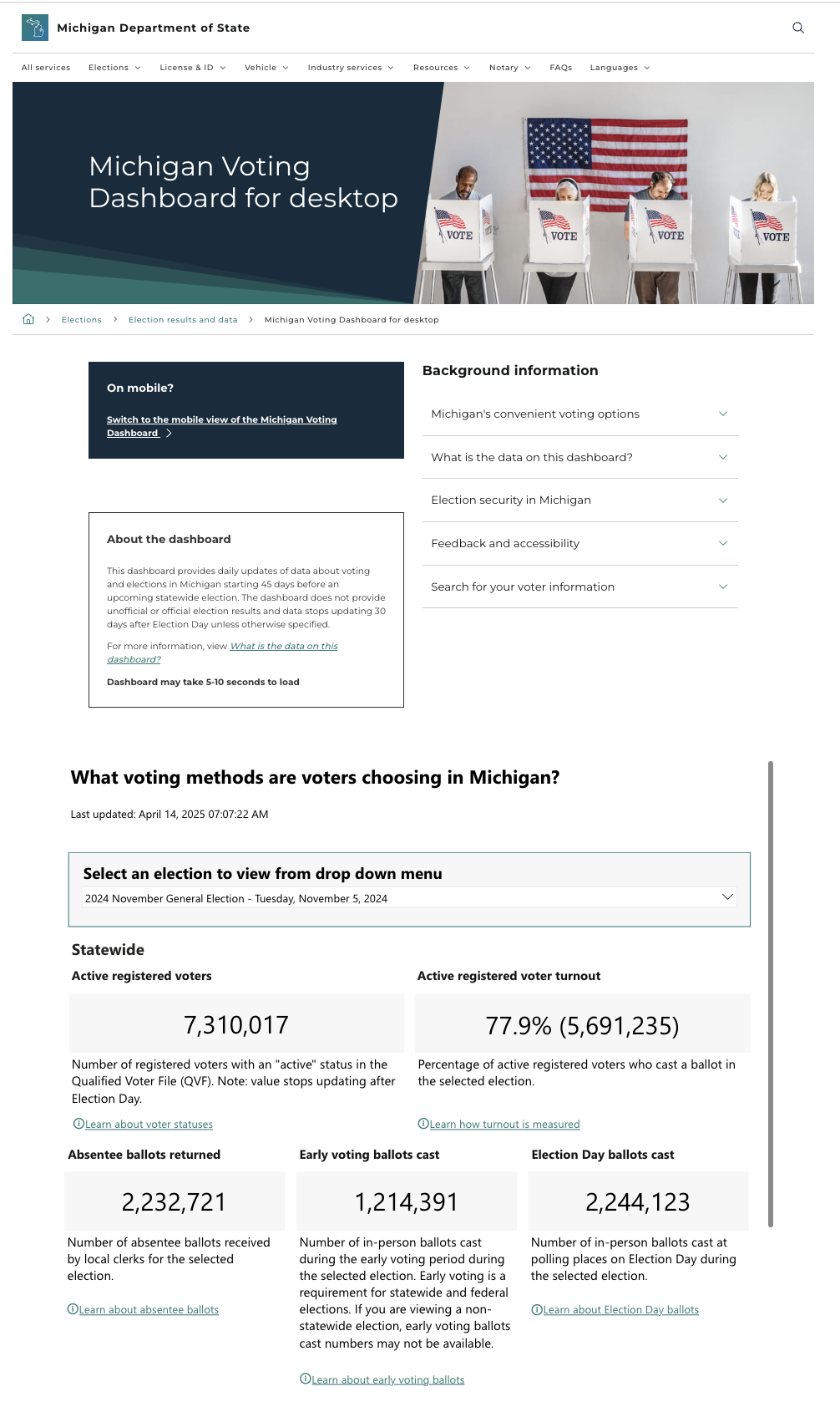
Image: A bird’s eye view of the Michigan Voting Dashboard.
Consider the flow of information
When it comes to the flow of information, start general and then get more specific. Think about the general viewer who is interested in this information and how they will engage. Then ask what they might want to know if they had more questions, and organize the information with this logic.
Start with the information most visitors want to know and narrow it down to what they will want to know next. For example, after learning about the number of registered voters in the state, people might want to know the numbers per county.
The Michigan Voting Dashboard starts with the general state level information and then moves to municipality information. This way, viewers who wanted more specific information would have the opportunity to delve deeper.
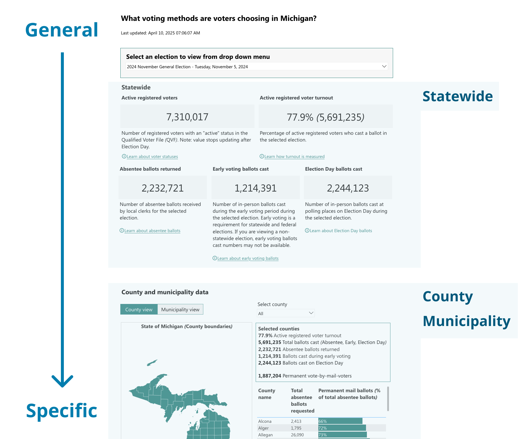
Image: This illustration shows how the dashboard is organized from general to more specific
Narrow down your data to the essentials
Sharing too much data can overwhelm readers. On the other hand, too little data can leave viewers confused.
To find the happy medium, think about the framing of your data.
Ask yourself:
- What would a voter want to know first?
- What would a journalist or policy analyst look for?
- What’s been most commonly requested in the past?
- Who is the main audience of this dashboard?
For the Michigan Voting Dashboard, viewers wanted to know the number of active registered voters and the active registered voter turnout right off the bat. These numbers are prominently displayed at the top of the dashboard.
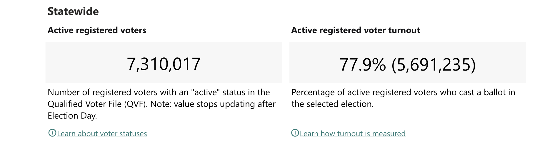
Image: The information viewers want to know first is displayed at the top of the dashboard.
It’s helpful to consider the context in which people are viewing your data and the expectations they are bringing with them. Sharing data is a way of contributing to an existing conversation. Which numbers are typically displayed in dashboards like yours? Pull from existing conventions of what people expect to see. For example, if you don’t include a number commonly found in other places, viewers will likely wonder why it’s left out.
Lastly, make sure all the data you’re displaying relates to your dashboard’s main theme. It’s easy to get lost in numbers when putting together data, so take a step back and ask yourself whether all the numbers are relevant. An example of information that’s not directly related could be historical voting information. If it’s not directly relevant to the main point of the dashboard, it likely doesn’t belong on the main dashboard.
Use visual indicators to direct people to more information
A visual indicator is an image or symbol that draws attention to something specific. You can use a visual indicator to give viewers a way to learn more without overwhelming the initial dashboard or confusing the audience who are only looking for the basics. This also gives viewers the chance to answer further questions without overwhelming the dashboard.
Organizing information this way follows the principle of the bite-snack-meal, a framework we use to structure information into 3 different sizes. Ask yourself, “What is the minimal information viewers will need to understand the data being displayed, and how do you display that information best?” That’s your bite. The snack will be a slightly expanded version of the bite, while the meal is all the information you want to share.
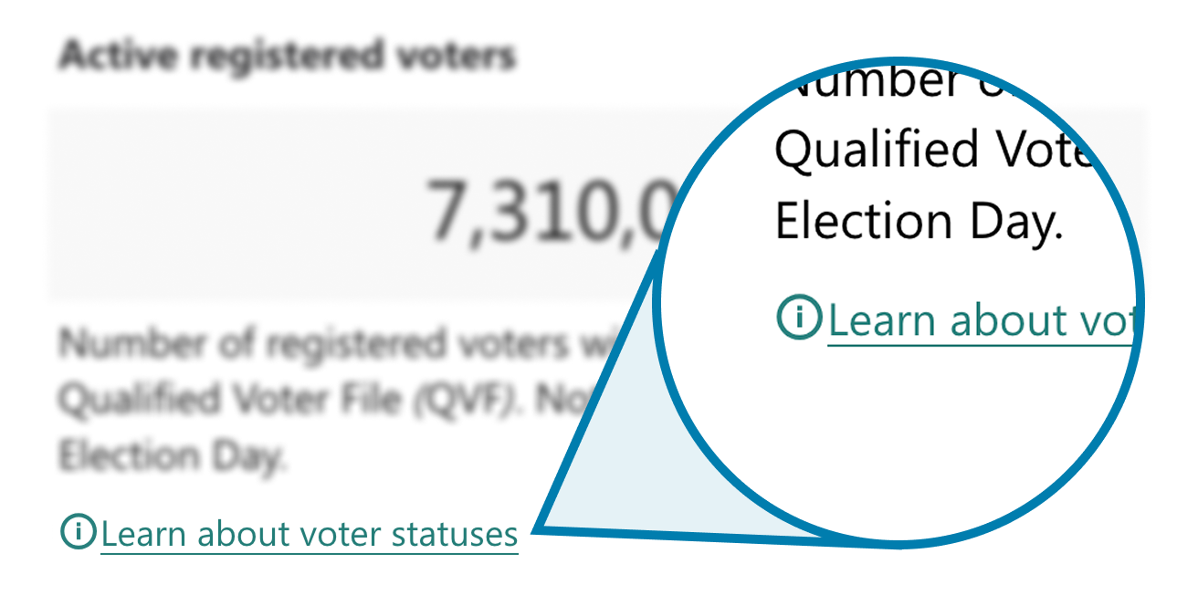
Image: The i bubble helps communicate to viewers they can click to learn more.
Visual indicators can help navigate viewers from a bite to a snack on a webpage. For example, on the Michigan Voting Dashboard, the number of active registered voters are displayed on the homepage. For those interested in learning more about voter statuses, they can click on the link and find a popup that shares more information. These icons appear after each section to provide more information about the topic.
Clearly state when the data was last updated
Have you ever had the experience of reading a webpage and simply not being able to figure out when the information you’re reading was published? It’s easy to forget that what you publish online will live on indefinitely and if there’s no clear date listed, people in the future will wonder when it’s from.
That’s why it’s important to consider future plans when setting up a new data project. How will this data be maintained? Will it need to be updated over time or is it static?
For the Michigan Voting Dashboard, two indicators tell viewers about how current this information is.
The “About this Dashboard” section on the top clearly states that there will be daily updates 45 days before an upcoming statewide election in Michigan and that the data will stop updating 30 days after an election day in Michigan.
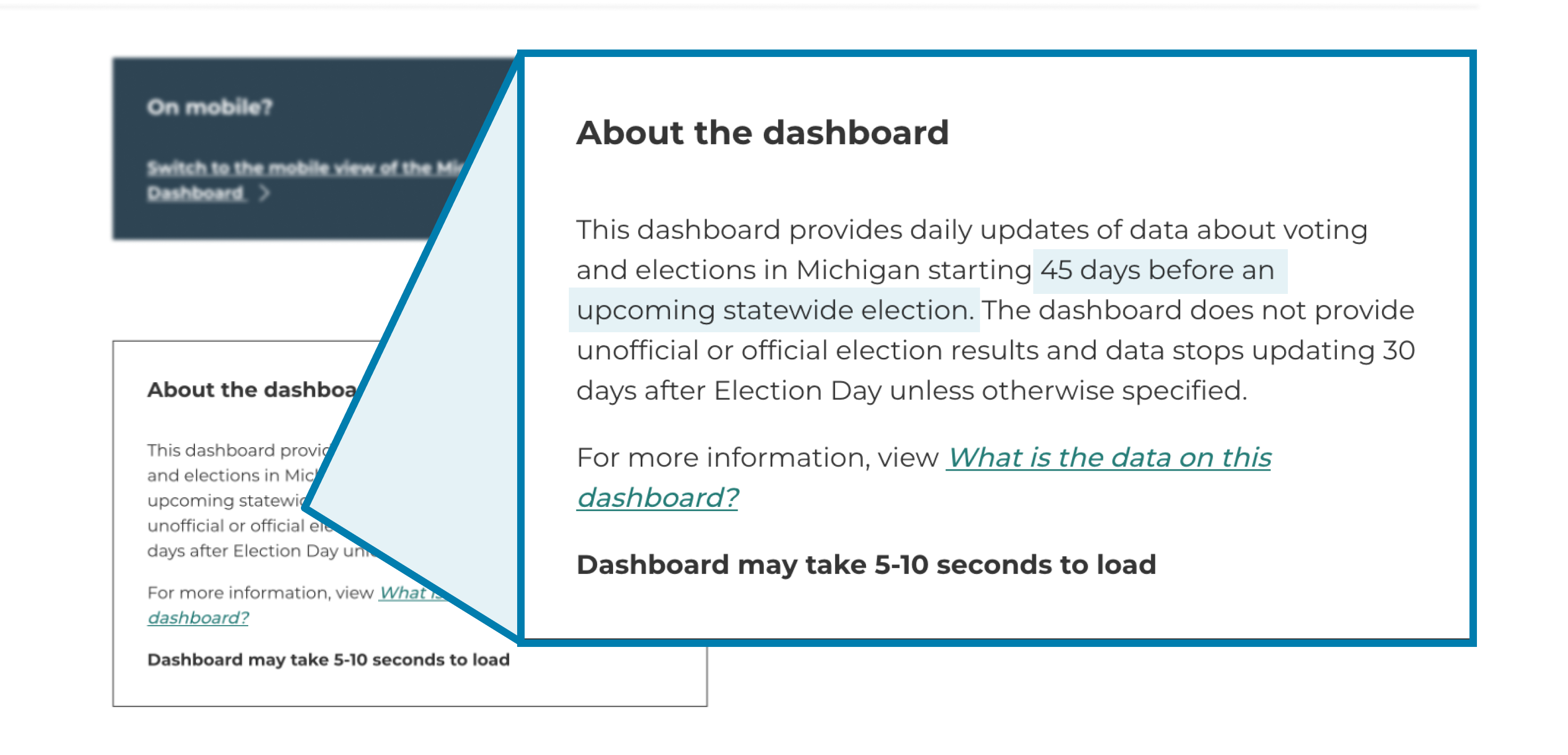
Image: The Michigan Voting Dashboard clearly states when the dashboard will be updated
Make sure the date the information was published is listed clearly, preferably at the top of the screen. If the data will be updated periodically, make it clear when and how often viewers can expect updates. On the Michigan Voting Dashboard, there is also a line that clearly states when the dashboard was last updated, so readers know when this data was published.
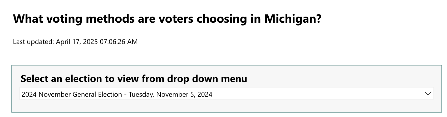
Image: The dashboard also clearly states when it was last updated
Create a plan for maintaining your data
Consider how you will update your data in the future. The Michigan Voting Dashboard will be updated before every statewide election. This means a maintenance plan must be built into the process of sharing the dashboard.
If the dashboard will be updated live, make sure you know which specific numbers need to be maintained, and who on your team is responsible for updating them.
Illustrate geographical information with a map
A map can be a very effective way to display state data or local data, especially when dealing with information tied to a specific place.
The Michigan Voting Dashboard includes two different maps, county view and municipality view. Using the bite-snack-meal framework, the first map starts with more general data and the second gets more specific.
Also consider that there are many different types of data visualizations that can help make data simple and easy to understand for the intended users.
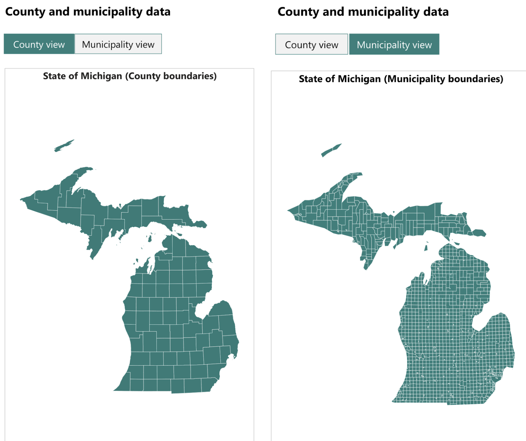
Image: The Dashboard starts with the county view and the second map is more specific by displaying municipality view
Some visualizations options are:
- Map – best for comparing different counties and municipalities or when location is a key data point. For example: Voter turnout by municipality
- Line graph – best for comparing or showing change over time for many data points. For example: Voter turnout over several elections
- Bar chart – best for comparing different categories of data. For example: Ballot cast by voting method
- Pie or donut chart – best for comparing and showing proportional distribution of a larger overarching data point. For example: Breakdown of voting methods used.
View the full tool on the Michigan Voting Dashboard on the Michigan Department of State’s website.
© 2025 Center for Civic Design