Designing impactful and culturally responsive voter education
Designing impactful and culturally responsive voter education
This research started with a big question: how can visual design and the use of design elements with cultural relevance make voter education material more effective in engaging and informing voters? We have long known how important it is to create voter education materials that speak directly to voters. But we wanted to go further and understand how design elements like color, images, and presentation or layout can make information more effective in appealing to—and informing—voters from diverse communities.
Our insights from this research are organized into 3 broad themes:
- Design has an impact on voter engagement and trust
- Visual language of layout, images, and color can invite participation
- Digital tools can benefit or create barriers to reaching a community

Visual and information design research: Designing impactful and culturally responsive voter education
Download reportKey findings
We found 14 insights for impactful design that fit into 3 overall categories
Design has an impact on voter engagement and trust
1. Voters trust engaging and well-designed professional-looking GOTV materials.
2. Voters want to know why they should vote.
3. Voter information has to fill civic literacy gaps.
4. Voters are wary when materials mix advocating for how to vote on a ballot question and basic voting information.
The visual language of design can invite participation
Using layout and structure
5. Voters notice when headlines and callouts address issues they care about.
6. Color can help structure the information to capture and direct voters’ attention.
7. Bilingual layouts can invite new voters with varying levels of English fluency.
Using images
8. Images are impactful and engaging, but require careful selection.
9. Voters want to see racially and ethnically diverse communities represented in images.
10. Images depicting people of only one race made many Black voters feel targeted.
11. When used carelessly, cultural imagery and language can make communities feel targeted or create division.
Using color
12. Culturally significant colors and images have impact, but are more effective when used by a familiar organization than by an “outsider.”
13. The use of red, white, and blue and patriotic imagery can discourage young voters.
Digital tools can help or create barriers to reaching a community
14. Voters have varying relationships to digital and online voter information, depending on age, access, and language.
Putting the research to work
We created a toolkit based on this research. In this toolkit, you will find:
Bite-snack-meal content framework
Communications strategy planning document and customizable messaging for your voter education materials.
Starter templates
Canva templates for GOTV materials in the Bite-Snack-Meal framework.
Design recommendations
13 recommendations that show you how to incorporate information design into your materials to create the most impact.
About the research
From September 2023 to January 2024, we conducted a qualitative research project in Ohio to learn how to design voter education for multilingual communities of voters.

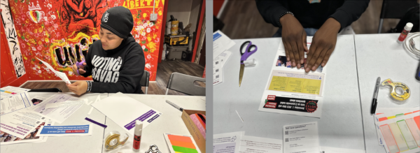
We used qualitative and participatory research methods to understand the various ways in which voters perceive visual and information design:
- In-depth semi-structured key expert interviews with Steering Committee Members of the Ohio Voters Rights Coalition (OVRC) to learn about their existing process of creating materials and communications ecosystem.
- Listening sessions with our 5 partnering community-based advocacy organizations to understand their existing voter efforts and challenges.
- A design audit and analysis of partnering organizations’ existing voting materials used during the 2023 election season.
- In-person usability testing sessions with 61 participants across three cities (Cleveland, Akron, and Columbus) in the lead-up to Ohio’s August 2023 Special Election and the November 2023 General Election. We tested materials in English, Spanish, and Nepali.
This research was conducted by Andrea Miranda Salas and Emma Werowinski.
Related resources
We created a toolkit based on this research to support community-based and voter advocacy groups to create engaging, accessible, and action-oriented voter education materials.
Visit our page on connecting to community groups to find more resources developing relationships with communities and inviting more voices into election design.
Visit our page on information design for information on basic best practices to make information you want to share clear, engaging, accessible, and usable.

