
Help voters navigate the polling place with better signage
Help voters navigate the polling place with better signage
Imagine being a new voter. You enter the polling place and try to figure out where to go next.
Do you go straight? Left? Upstairs? To a table?
Without clear signage, even confident voters can feel unsure.
Clear signage helps every voter feel like they’re in the right place and know what to do next.
The new polling place signage toolkit
Good signage makes voting easier for everyone. It helps people move through the space smoothly, find the right table or room, and know what to expect next. It also saves time for poll workers by answering common questions before they’re asked.
But designing good signage takes more than printing out a sign that says “Vote Here” and taping it to a wall.
That’s why we created the new Polling place signage toolkit.
This nonpartisan resource is for election offices of all sizes. Whether you’re designing signs for a brand-new voting location or improving what you already have, this guide will help.
Curious what’s in the toolkit? Find a few highlights below.
Use our templates to create your own signage
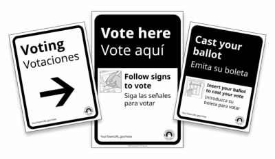
In addition to signage guidance and best practices, the toolkit also includes templates you can use to create your own signs. We’ve designed them to support 2 languages (English and Spanish or another language of your choice.
These templates will give you a head start and come in different sizes to fit the needs of your polling location.
There are 2 types of signs, directional signage and informational signage. Directional signage helps people navigate a space, while informational signage provides specific instructions or other information to support understanding and confidence at decision points.
We designed this layout to do both.
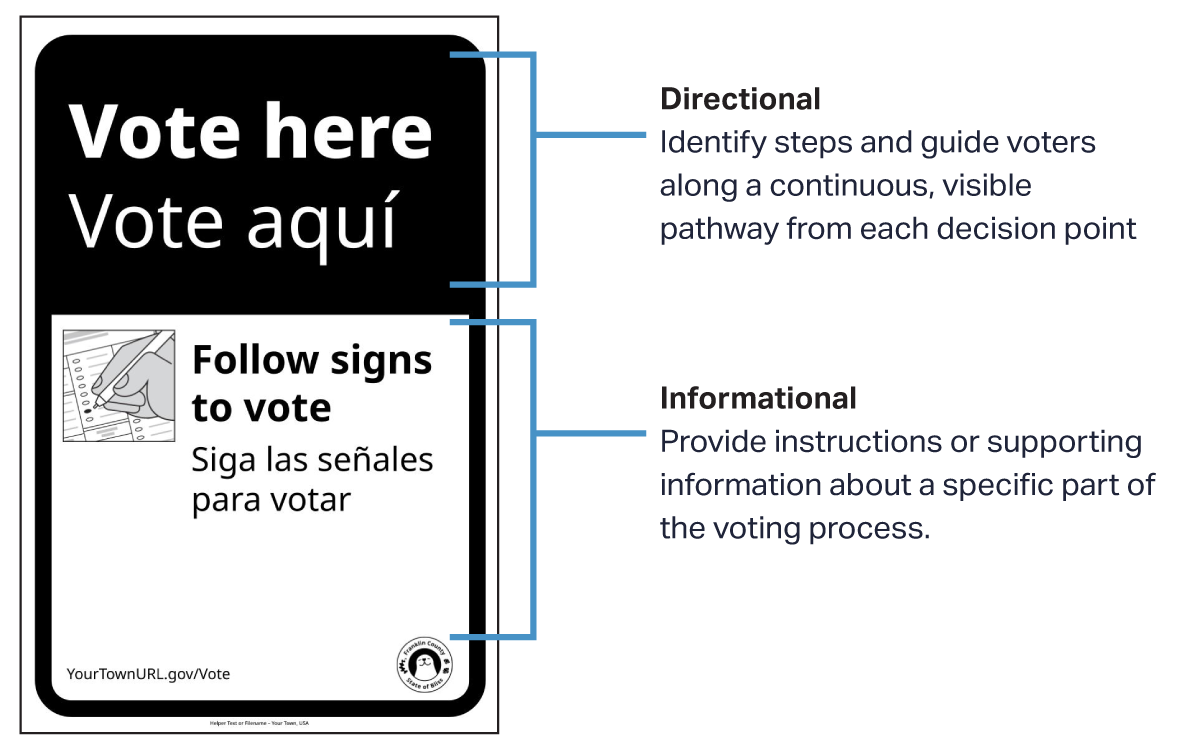
Image: The sign above is an example of how you can combine directional and informational signage.
This way, voters can both know where to go, and have additional helpful information they need.
2 simple ways to improve your signage
Here are two small changes that can make a big difference in your polling place:
Use signs voters can see without stepping closer
Our guide recommends using a font size of 16pt per foot of distance. That means if a voter is standing 6 feet away, the text should be at least 96pt.
16pt per foot is readable for people with a visual acuity of 20/200. This means anyone whose visual acuity is better than the legal blindness threshold in the U.S. should be able to read it.
A heading text should be the largest font size. This is typically directional text such as in the example above (Vote here). Supporting text with additional instructions can be smaller to be readable up close.
Make sure signs are visible
To make polling place signage more effective, make sure they stand out and are easy to see. Too many posters in one area space can compete for attention, so using larger signs, bright colors, or freestanding displays can help increase visibility.
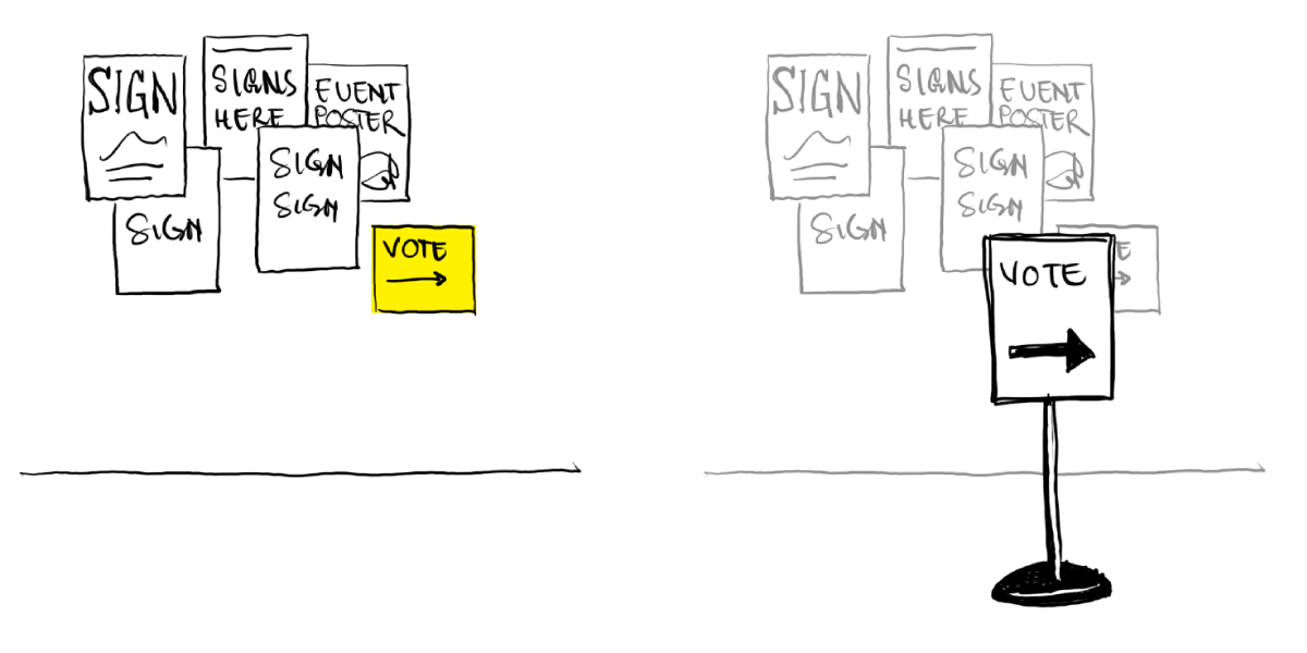
Image: Signs easily blend in when there are many posters in one location
One way to make sure signs are visible is to plan ahead by thinking about where people will be and how lines might form. Signs placed on tables, for example, are often blocked by people standing in front of them.
Too many signs in one area can overwhelm voters. Instead, spread out key messages along the pathway so voters have time to absorb each piece of information as they move through the space.
Think about where voters need signs most to guide them, and place signs in those spots.
Want to improve your polling place signage?
The Polling Place Signage Toolkit is full of recommendations like these.
You don’t have to be a signage expert to create excellent and helpful navigation. Our toolkit was created for election officials and is intended to be simple and easy to follow. Here’s what you’ll find:
- Specific and practical signage best practices
- Bilingual signage templates
- Clear guidance on fonts, arrows, colors, and layout
- Tips for using your office’s logo and branding
- Accessibility best practices and examples
- Links to icons, illustrations, and more resources
Our best practices are backed by research and real-world testing so that you don’t have to reinvent the wheel.
Polling place signage toolkit
Signage guidelines and ready-to-use templates for election offices of all sizes.
If you have questions or feedback, we’d love to hear from you: hello@civicdesign.org
This resource was developed in collaboration with the U.S. Alliance for Election Excellence, a nonpartisan collaborative that brings together election officials, designers, and experts to help local election departments improve operations, adopt shared standards, and run successful elections.
© 2025 Center for Civic Design