
Design manuals that empower poll workers on Election Day
Design manuals that empower poll workers on Election Day
Have you ever picked up an instruction manual with a question about how to fix a device and found the answer you needed in a few seconds?
Neither have we.
More likely, you looked through a manual and thought, “Wow, I’ll never be able to find what I need buried in all of this text.”
There’s no reason for that. Manuals can be both useful and pleasant to read. And that includes your poll worker manuals.
Poll worker manuals are essential to ensure an election runs smoothly. Manuals support poll workers in reviewing all of the new information they learn during training. They also help poll workers on election day, when they often face new scenarios and questions from voters they may not know the answer to.
Great manuals answer questions and empower election workers to feel confident while doing their jobs. Poorly designed manuals lead to confusion on election day and more calls to your office.
We’ve just published three resources for designing manuals for poll workers.
The three resources address the various stages of assembling a poll worker manual and share the behind-the-scenes elements that go into creating a well-designed manual.
- The best practice guide: If you already have a manual but are just looking to update it, this one is a great place to start.
- A Word template: If you are starting from scratch, we have a Word template you can start using right away.
- How-to-use Word guide: If you’re using Word and want instructions on how to make the most of the software, start here.
Find the resources on the U.S. Alliance for Election Excellence’s website.
Our goal is to help you help poll workers, who will, in turn, help their voters. You can use these resources to help you easily make updates to whichever manual you already have or as inspiration for a new one.
These resources are made for election officials at every level of design and technology who are using any software or editing program, whether it’s Microsoft Word, InDesign, or Canva. The best practices we include can also be applied to organizing any type of manual, handbook, or long-form information.
We’re excited by the positive response we’ve received on these resources from election offices so far. Pete Duncan, from Macoupin County, Illinois, shared that making the changes recommended in our guide was a quick process. He was able to get 75% of the way through within two days.
“The manual was fantastic; I would have been lost without it. I’m the most basic Word user in the history of Word users. Whatever the default font is what I used. There was a whole bunch of stuff in the guide I’d never thought of.”
Pete Duncan, from Macoupin County, Illinois
How do you create a well-designed manual?
Sometimes, the sheer amount of information that needs to go into a manual can be overwhelming. Here are a few of the best practices we cover on how to organize information in a way that orients the reader.
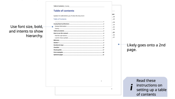
Create a useful table of contents
When you open a 100-page manual or guide looking for an answer to a specific question, where do you turn to first?
For many people, it’s the table of contents, where they are most likely to find the specific page with the information you need.
That’s why it’s essential to make sure readers can easily identify the information they need in the table of contents. Layout, text hierarchy, and indentations make the table of contents a useful navigation tool in the example below.
Clear headers help readers find the section they need
Headers are equally important as a way for readers to identify which specific section they are currently reading. Did you know you can create dynamic headers in Word to automatically set the headers of each section? We’ve found this shortcut can save a lot of time in the design process.
Visual cues also help show where a new section begins. You can do this by choosing a different color or gradient for each section or using section breaks.
Here are two examples that clearly distinguish when a new section starts and make it easier for readers to skim to the section they are looking for.
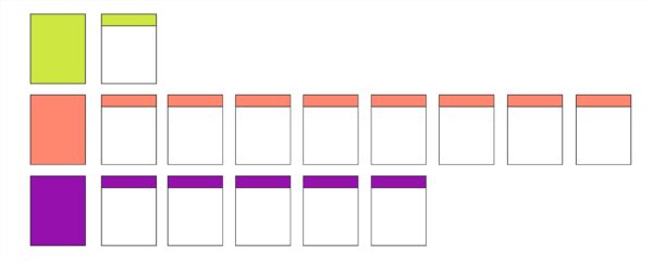
Caption: Headers can be effective in different colors or gradients if you’re using a black and white printer. The color is an additional cue, but the layout does most of the work in distinguishing hierarchy.
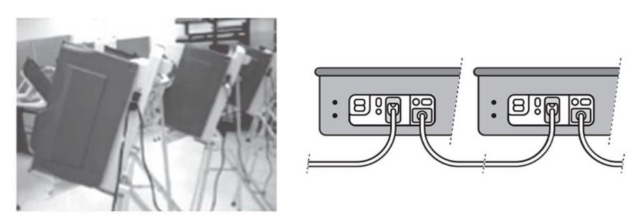
Use images and illustrations to support, not supplement, text
Sometimes, an image is worth 1,000 words; other times, it’s a distraction. In a manual, a graphic can either help explain instructions or only confuse readers. Illustrations are preferable to images. They more clearly highlight the point you’re making.
Take the two images below, for example. They both accompany these instructions:
- Connect the unit to the power receptacle (AC in) of the previous unit.
- This creates a daisy-chain of the voting units.
While the photo is blurry and doesn’t clearly show the cords, the illustration highlights exactly what the reader needs to know (while taking up less space).
Design text so that it’s easy to read
Have you ever started to read an article only to stop a few seconds later because the amount of text was too overwhelming?
A massive block of text can easily deter someone from reading the content. That’s why it’s so important to think about how information is presented.
Our best practices for designing text so that it’s easy to read include:
- Use bullet points and write short sentences
- Use headings to break long text into manageable chunks
- Limit each page to one topic
- Use the right typography to call attention to important details on the page. Use bold to emphasize information and italics for parenthetical information.
- Keep text in consistent fonts, colors, and size
- Use numbers for steps and bullets for lists that are not step-by-step procedures
- Use icons to call out important information and warnings
- Use left-aligned text to improve reading comprehension speed
These small changes can make a huge impact on how poll workers are able to find the information they are looking for and understand the information they find.
We can answer your questions as you use these resources, so feel free to reach out to hello@civicdesign.org or respond to this email. Happy designing!
These resources were developed in collaboration with the U.S. Alliance for Elections Excellence, a community of support focusing on the fundamentals of election administration. They were also published with a suite of other tools as part of a larger project on poll worker standards the Alliance is working on.
To learn more about the standards and how to give feedback, take a look at the Alliance’s website.
© 2025 Center for Civic Design