
Creating accessible forms for print + PDF
Creating accessible forms for print + PDF
Forms are an integral part of elections
Whether a community member is registering to vote, or a candidate is filing their intent to run, there are countless forms that play important roles during the election cycle.
Each of these forms embarks on a complex journey from start to finish, passing through many different people’s hands. Poorly designed forms cause confusion, frustration, mistakes, and delays. Good forms, on the other hand, are easy for a user to complete accurately and easy for an election administrator to file.
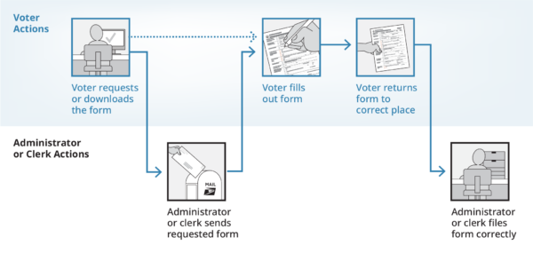
During our years of testing forms with real voters and election administrators, we’ve developed a suite of best practices that improve the likelihood that every form will successfully make it through its journey. We’re excited to share them with you now in this workbook.
What’s in this workbook
This workbook is based on CCD’s sidewalk style form, but many of the best practices outlined here can also be applied to other form layouts.
To help speed up your work, we’ve included an InDesign template for the sidewalk style form that has many accessibility features built-in. This template makes it fast and easy to create print masters and accessible, fillable forms at the same time. Whether you choose to build your own form from scratch or use our InDesign template, this workbook is full of our research-backed tips and tricks for designing forms that help voters succeed.
Section 1. The anatomy of a sidewalk style form
Section 2. Download our InDesign template to speed up your form design
Section 3. Bird’s eye view of a sidewalk style form
Section 7. Language and text formatting
Section 8. Digital accessibility for fillable PDF files
Section 01
The anatomy of a sidewalk style form
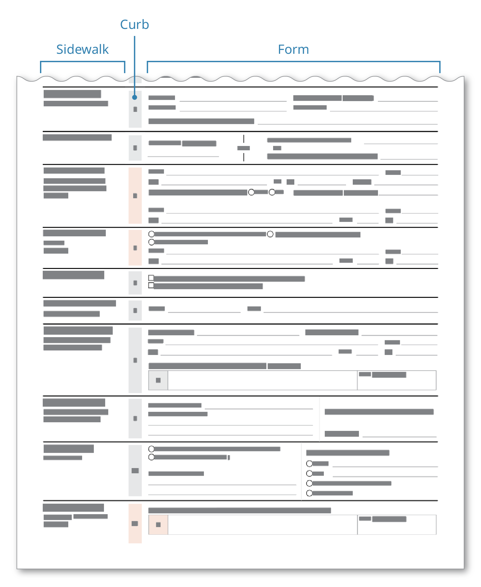
To improve the likelihood that every form will successfully make it through its journey, we’ve developed what we call the sidewalk style form — “sidewalk” because these forms contain crucial signposting information and instructions in a narrow section to the left (the sidewalk), which is separated from the form section by a “curb”. These 3 sections work together to guide the user, rather than confuse them.
The sidewalk-style form works best on complex forms with many different sections and requirements. Put another way, it works best on forms where people make mistakes. Some examples include:
- Voter registration applications
- Mail-in ballot requests
- Mail ballot preference forms
- Candidacy forms
Most, but not all of these are voter-facing forms. For the rest of this workbook, we’ll refer to the user as the voter, just to make things simple.
Section 02
Download our InDesign template to speed up your form design
Designing a new form from scratch is time-consuming. But it doesn’t have to be.
We’ve developed an InDesign template for our sidewalk style form so that you can quickly and easily create new forms. And the best part? This template makes it fast and easy to create print masters and accessible, fillable forms at the same time.
Downloadable InDesign form template (8pt)
This template version is in 8pt font size.
Download 8pt InDesign templateDownloadable InDesign form template (11pt)
This template version is in 11pt font size.
Download 11pt InDesign templateCreating accessible forms in InDesign is much easier if designers are already comfortable with the basics of the software. Even a little practice upfront saves time later, allowing the team to focus on accessibility and good design instead of troubleshooting tools.
View our list of recommended resources to start learning InDesign.
Section 03
Bird’s eye view of a sidewalk style form
Forms aren’t everyday objects. Most people only fill out a handful of them in a year. Because people don’t see them that often, it’s especially important that what goes in your form and where those things go appear predictably and consistently.
The general layout of a form can have a large impact on a voter’s experience with it. If it’s laid out logically, where the elements appear in an expected way, the voter is more likely to complete it accurately and return it successfully.
The best way to do this is to keep sections and tasks distinct so the voter can focus on 1 thing at a time.
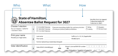
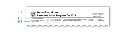
The form heading is the 1st thing a voter sees
Before the voter even begins filling out a form, they need to make sure that they have the right one. Since the top of the form is the first thing the voter sees, this identifying information should go at the top in the heading.
The form heading should do 3 things. It should tell the voter:
- Who made the form
- What the form is called
- How the form is used
Each area has its own purpose
A form’s main purpose is to collect information from a voter. But, sometimes the form also has to provide information like instructions. Voters see the task of reading and understanding as different from the task of filling in their information. The sidewalk layout makes it easy to keep these 2 tasks distinct, allowing the voter to focus on 1 task at a time.
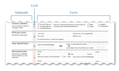
Sidewalk
- This is the first thing the voter sees in each section.
- Information about the section goes here.
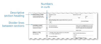
Curb
- This tells the reader the number of each section.
- The curb visually separates the sidewalk from the form fields.
Form
- All form fields, checkboxes, etc., are in the same place.
- This is the only section where the voter enters information.
Use sections to group related fields
Break the form into logical and manageable sections. The fields in each section should revolve around a theme or category.
Descriptive section headings, numbers in the curb, and horizontal lines between sections signal to the voter that each section is distinct from the other sections.
Section 04
The sidewalk
The contents of the sidewalk act as the signpost for what the voter can expect in each section.
The sidewalk has 2 parts
Section title – This is the descriptive heading for the section. It tells the voter what to expect in this section.
Section instructions – Instructions that only apply to this section go here. Some examples are:
- “Optional”
- “Assistant”, complete this section.”
- “If your mailing address is different from your residential address, complete this section.”

Make it clear which sections are required
If every field in a section is required, write “Required” in the section instructions. Consider using red for the word “Required” and for the curb to make these sections stand out.
Use color to contrast required sections with optional sections. If every section on the form is required, don’t use color like this.
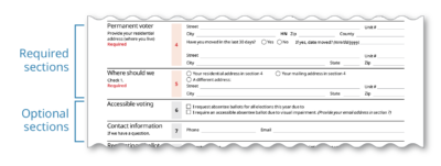
Remember to keep accessibility in mind. For example, using color alone to indicate that a section is required isn’t enough. If the voter is color blind or if the form gets printed in black and white, this information is lost.
→ Use our election materials color palette for help on choosing accessible colors.
Section 05
The form area
The form area is where the voter provides all their information.
Design text fields that read in a logical order
There are 2 elements of a text field—The field label and the field itself. When there are many text fields clustered together, it can become difficult to tell which field label is associated with which field. In English, we read from left to right and top to bottom. To preserve this logical sequence, always try to put the field label to the left of the field. This arrangement is the most accessible to both sighted and screen reader users.

If you’re tight on space, putting the field label above the field is a 2nd option. Avoid putting the field label below or to the right of the field.
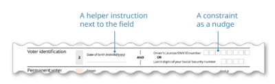
Give hints to help the voter fill out fields correctly
If instructions apply to a whole section, they should go in the sidewalk. But sometimes, a voter could use a little nudge to make sure that they’re filling out a specific field correctly. For example, most offices prefer dates in a specific format. This type of helper instruction should go directly next to the field. Italicizing the nudge helps the voter see that it’s distinct from the field label.
Sometimes you can nudge the voter to fill in a field correctly just by putting constraints on the field. For example, if your state’s driver’s license number has exactly 8 characters, provide exactly 8 spaces for the voter to fill in their information.
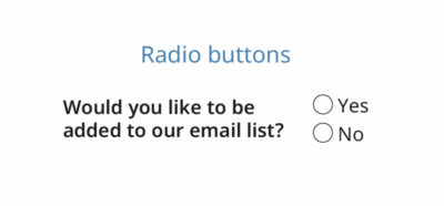
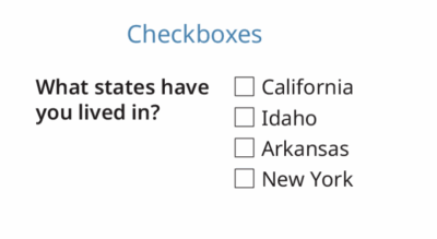
Use the right type of selection field
There are 2 types of multiple choice selection fields: checkboxes and radio buttons. If you want the voter to only choose 1 option, use radio buttons.
If you want the voter to be able to choose more than 1 option, use check boxes.
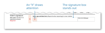
Make it easy for voters to sign the form
People forget to sign forms all the time. You can make it easy for them by paying special attention to the design and the language around the signature space.
- Use a signature box so it stands out from the other elements on the form
- Tell the voter exactly where to sign – “Voter, sign here”
- Add an “X” in the signature box to draw the voter’s eye to the box
- Consider using red to further draw attention to the signature box
- Give specific instructions next to the signature box – “No electronic signatures allowed”, or “Required”
- If your state collects signatures for verification, make sure the space is big enough for the voter to give their full signature.
See these resources for more information about forms:
→ Field Guide 10: Creating forms that help voters take action
→ Now is the time to update your forms – tips for writing and designing forms
Section 06
The instructions
Complex forms require simple instructions. If you choose to include instructions on a separate sheet or in a separate section, make sure that they are useful and usable.
Put the most useful information at the top
Put the information that every voter will need at the top. This might include:
- Who can use this form
- How and where to return this form
- Board of elections contact information
If you want to nudge the voter towards using an online portal instead of submitting a paper form, the top of the instructions would be a good place to put that information.
Avoid obvious instructions
From our testing, we’ve seen that voters only refer to the instructions when they get stuck or have a question. If a section on the form asks for the voter’s name, there’s not much more to be said. Resist the urge to give exhaustive enumerated instructions for each step on the form.
However, if a voter’s name has changed, and the name section on the form can be used to update their voter record, the instructions would be a good place to say that.
Be general on the form; be specific on the instructions
If a voter’s near relative can request an absentee ballot for them, it’s enough to use the phrase “near relative” on the form. Most people will know whether they fall into the category of a near relative or not. On the instructions, you can list the legal definition.
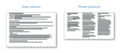
Consider using newspaper-style columns
A long line length that spans the width of the page can be difficult to read for low literacy voters. Experiment with using 2 or 3 columns of text in some parts or all of the instructions.
Section 07
Language and text formatting
The language and formatting choices you make are crucial. If done well, you can instill trust in the voter and guide them to successfully complete and return the form. On the other hand, using complex language and poor formatting can alienate and confuse voters. Fortunately, using plain language and following formatting best practices is easy to do.
Use plain language
Using plain language on a form makes it more trustworthy, less anxiety-inducing, and of course, easier to understand. These are a couple of the most useful and relevant guidelines for making forms.
Know your audience – Write for your reader by using their language. Avoid legalese.
- Do say: “I’m unable to appear in person on Election Day at my polling place because of the reason I gave on my application.”
- Don’t say: “I will be unable to appear personally on the day of the election for which this ballot is voted at the polling place of the election district in which I am a qualified voter because of the reason given on my application heretofore submitted.”
Use simple words – Short and common words are the easiest to understand.
- Do say: Help, choose, must
- Don’t say: Assist, designate, shall
Use simple sentences – A simple sentence is short with around 1 idea.
- Do say: “Return your completed and signed form to your local board of elections. You can return it by mail, fax, or email. You can also drop it off in person.”
- Don’t say: “Return your completed and signed form to your local board of elections by mail, fax, email, or by dropping it off in person.”
Use positive language – Give affirmative instructions instead of what not to do.
- Do say: “For your ballot to count, you must sign this form.”
- Don’t say: “Your ballot will not count unless you sign this form.”
Use words consistently – If there are many ways to say something, pick 1 and stick with it.
- Example: Eligible, qualified, and entitled all mean the same thing. By using these words interchangeably, the voter might think that they have different meanings or implications.
Use active voice – Active voice uses the standard word order in English. Passive voice reverses that order.
- Do say: “You must submit this form…”
- Don’t say: “This form must be submitted…”
Say “if” before “then” – “If-then” clauses don’t apply to everybody so don’t make everybody read them all.
- Do say: “If you have moved to this county in the last 30 days, complete this section.”
- Don’t say: “Complete this section if you have moved to this county in the last 30 days.
Speak directly to the reader – Address the reader as “you” instead of “the person” or “the voter”.
- Note: Sometimes a form has many users, e.g., the voter, an assistant, a notary, etc. Always address the primary user (the voter) as “you” and address the secondary users by their title, e.g., “The assistant must sign this section”.
Keep oaths separate from form fields – Let the reader read the oath, then provide their information. Don’t scatter fields throughout an oath.
→ Read Making ballot envelopes clear and understandable: The impact of plain language on voter signature forms. Our research on why fill-in-the-blank forms are harder to use and why bullets are an effective way to make complex legal text easier to read and understand.
Use text formatting best practices
Text formatting is the visual side of plain language. Good formatting guides the voter through the form and prevents confusion and mistakes.
- Left-justify all your text – In English, we read left to right. So always put your text to the left where readers expect to see it.
- Use bullets – Break up long sentences, especially lists, into bullets.
- Use a simple sans-serif font – Noto Sans, Open Sans, and Calibri are good choices.
- Use headings to help the voter navigate the form – Always tell the voter what to expect in the headings and subheadings.
- Use bold to call attention to something – Bolding something will catch the reader’s eye. All caps is hard to read and underlining implies a hyperlink.
- Use white space to “chunk” information – White space helps the reader know where 1 section ends and another begins.
- Use title case or sentence case – Use title case for your highest level heading and sentence case for everything else. Never use all caps.
- Use color effectively – Make sure your color choices are accessible. Our elections materials color palette is a good starting point.
See these resources for more information about language and formatting:
→ Attention-grabbing style: typography to grab (and hold) your reader’s attention
→ Field Guide 01: Designing usable ballots
Section 08
Digital accessibility for fillable PDF files
The goal of every guideline in this workbook is to make forms more accessible to all voters. When election forms are made available to download as a fillable PDF file, they need special care to make sure that they have good digital accessibility.
This section focuses on making fillable PDF forms more accessible, especially for screen reader users.
Use logical headings
All voters rely on logical headings to help them quickly navigate a document to find what they need. Voters who are sighted usually do this by taking visual cues like relative font size and boldness into account. Screen reader users rely on headings tags, which the forms designer must do manually. For example, as a screen reader tabs through a form, the screen reader will tell the voter that the section they are reading is heading level 2 (H2), which is nested within an H1.
Add alt text to images or artifact them
Screen readers can’t read images. If an image contributes meaningful information to the voter, it’s important to include a description of how that image is meaningful.
On the other hand, sometimes there are images on a form that don’t contribute any meaningful information. For these images, it’s important to artifact them—or make them invisible to a screen reader.
→ Read this for how to write great alt text
Write a description or tooltip for each form field.
Some screen reader users prefer to cycle through each field while ignoring any of the text on the form. As they arrive at each field, the screen reader reads the tooltip, which the forms designer needs to customize for each field.
The key to writing good tooltips is to provide the voter with enough information so that they can confidently and accurately provide their information without any other context. For example, for an address field, “Enter address” is confusing and ambiguous. Is it the residential address or the mailing address that the form wants? Also, avoid spatial directions like “same address as above”. Instead, use directions like “same address as residential address in section 5”.
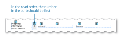
Set the read order
A screen reader needs to know what order to read things in. Sometimes the read order that makes sense to a screen reader user is not the usual left-to-right order. For example, although the number in the curb appears to the right of the sidewalk, we want the screen reader user to hear this number before the sidewalk text.
See these resources for more information about digital accessibility:
→ Add structure to PDFs (Adobe InDesign support page)
→ Tips for accessibility in Word
Section 09
Testing your form
The best practices and guidelines in this workbook are a good starting point for creating your forms. But every form is different. The best way to find problems with your form is to watch people as they fill it out.
Testing a form is a great way to find out what’s working (and what isn’t) and why. If you’re testing an existing form, you probably already have a good sense of what isn’t working, just from looking at returned forms. Did the voter write today’s date instead of their birthdate? Did they miss the signature box entirely? But listening to a voter as they navigate a form will help you come up with solutions that aren’t obvious just by looking at the mistakes.
See these resources for more information about usability testing
→ Field Guide 03: Testing ballots for usability
→ U.S. Alliance for Election Excellence: Usability testing kit
→ Guidance for How to conduct usability tests with voters
Section 10
What to do when…
Not everything fits
Remove redundant information – Sometimes a form will ask the voter to provide their name near the top and again near the signature. Is there a legal or administrative reason that you need this information twice?
Remove unnecessary information – The redesign process can sometimes function as an audit of all the information on a form. You might find that some of the information is no longer necessary because of a change in the law or advances in technology. For example, if you’re printing a label that will go on a provisional voting application, does the voter really need to provide all that information again?
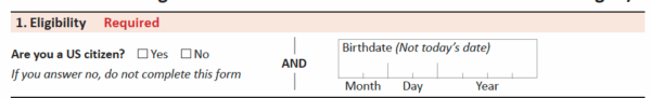
Reorganize the fields to make things fit better – How you divide up your form into sections is usually flexible. Some groupings of fields are obvious—The whole residential address should go in the same section. But other groupings are more flexible. For example, in some states, the only required eligibility question is about US citizenship. Dedicating an entire “eligibility” section to this one question can introduce a lot of wasted space. To solve this, you can put the “birthdate” field in that section. Or, “birthdate” can go in an “about you” section if that helps solve another space issue.
Put the form on 2 pages – Fitting a form onto 1 page is ideal. A 1-page form is easier for a voter to complete accurately and faster for an administrator to file. But the consequence of cramming all the required information onto 1 page can invalidate those benefits.
The legal language is confusing or distracting
Rewrite it in plain language Often, the law will state what must go on a form, but not exactly how it must be written. It’s usually possible, and indeed much more useful to everybody involved, when the text on a form is written in plain language.
Use bullets If you’re not able to rewrite the legal language in plain language, you can usually add bullets to make lists clearer. In our research on the oaths that appear on ballot envelopes, we found that just adding bullets to legal language substantially improved its readability.
Background the legal language If there is a requirement that some specific language must appear on a form, but that information doesn’t help the majority of voters complete the form, try putting that information at the end. For example, details on the punishments for violating election laws should go after all the usable parts of the form.
Creating non-English monolingual forms
It is important to plan ahead if you need to create forms in languages other than English.
Will the form be monolingual or bilingual? The first decision you need to make is whether those forms will be bilingual (English and another language) or monolingual (only the other language). Bilingual forms involve additional design considerations.
Know what languages and dialects the form will be translated into: Different languages take up different amounts of space on the page. For example, Spanish takes up more space than English, while Chinese takes up less. If the form will be translated into a language that will expand, like Spanish, include additional white space in the English version.
Use the right words: Election forms include a lot of specific terminology. It’s critical to use the right election terminology when translating into another language. Your state might already have a terminology glossary. Or, you can start with the EAC’s Glossaries of Election Terminology, which have been vetted and tested.
Get in-language feedback: The best way to find out whether a form in another language is usable is to get feedback from real users. Using a glossary is a great start, but it might not account for dialect differences in your community. Ask trusted community organizations to review your form for translation feedback. Even better, do user testing in other languages. Use our guide to Conducting multilingual usability testing.
There need to be many versions of the same form
Use the right format for the right purpose – Not all PDFs are equal. Make sure that the version for web distribution is saved as interactive (fillable) and the version for print distribution is saved as print.
Use a mailer version – For voters who don’t want to or can’t fill out an online version of the form, make the process easier for them by providing a mailer version. A mailer form has the form itself on 1 side of the page and all the postal information like addresses and postage on the other side. After the voter fills out the form, they fold and tape it, and mail it like any other mail piece. See the Pennsylvania Voter Registration Application for an example of a mailer form.
Section 11
Examples
Georgia Absentee Ballot Application
Pennsylvania Voter Registration Application
Pennsylvania Application for Absentee Ballot
North Carolina Absentee Ballot Request
© 2025 Center for Civic Design