CCD turns 10! A decade of change in elections
CCD turns 10! A decade of change in elections
Ten years ago, the Center for Civic Design was founded on the idea that everyone who is eligible to vote should be able to and that many of the barriers to voting can be solved through design.
Voting in the US is complicated. Many people don’t know when they need to register, what forms they need to fill out, whether or not they need to bring an ID and if so, which kind. We often hear about how ballot questions are confusing or difficult to understand. Some citizens end up feeling that the entire process is too convoluted to navigate and give up.
We believe the issues don’t lie with the voter but with how the voting process is designed. Or, as we often say: democracy is a design problem.
With that mindset as our guiding principle, we’ve spent the last 10 years using design to improve the voting experience for millions of voters across the country.
Here’s the impact we’ve had along the way.
Table of contents
1. Reimagining the role of design in elections
2. Building the foundation for voter-centered elections with usability testing
3. Equipping election offices across the country with actionable tools
5. Responding to a constantly evolving election landscape
6. Looking back at a decade in election design

We started with a goal to improve election design so voters could find the information they need.
CCD’s story begins before CCD officially began. In the years following the 2000 Presidential election and the drama of “hanging chads,” co-founders Whitney and Dana each worked on projects related to usability and accessibility in voting and elections—often on different, parallel paths. They served on Federal Advisory Committees; conducted research with NIST, the Brennan Center, and other institutions; and contributed to standards.
In 2013, thanks to a grant from the Future of California Election (FOCE), they went from having to fit civic design work in between other, commercial projects, to being able to work on civic design full time.
Or as they said in their inaugural blog post, stuff just got real.
Our earliest projects in this new organization were all about improving design skills in elections communications.
Right time, right place to tackle our first project
As an official organization, one of the first CCD projects was research about how voters get the information they need. The goal was to improve the official voter guides in California.
This project gave us the first of many opportunities to investigate the answer to a question we’ve returned to again and again: How do we get the right kind of information to potential voters at the right time, in the right place?
We explored how voters find information about elections, and what works—and doesn’t work—about their current sources. We considered different kinds of voters and their experiences, including new voters, registered non-voters, infrequent voters, and potential voters.
A key insight was that voters need information that helps them bridge civic literacy gaps, and gives them the information they need, in words they understand. Based on our research, we developed a set of recommendations to help election offices do just that.
In the lead up to the 2016 election, we reviewed the voter guides from all 58 counties in California and were excited to learn that 33 adopted some part of the recommendations. Before we knew it, in California, more voters than not had access to more clear and helpful information about how to vote.
Designing a voter guide to an election
In many jurisdictions, election officials send a booklet to registered voters with information about what’s on their ballot and how…
Changing the conversation about design and elections
CCD’s approach to developing election information included introducing usability research and design principles to election officials and people working on election technology. “I think [until CCD], the public discussion around voting technology was much more around security and reliability and cost, but much less around making systems accessible and usable for all voters,” Larry Norden, Senior Director of the Elections and Government Program at the Brennan Center for Justice at New York University School of Law, said. But it became clear quickly that election staff were excited about this approach and that it helped them serve voters better.
Design in elections was a rare topic in the early days of CCD. “I remember being amazed that there were these experts in design who also had a passion for elections,” Ricky Hatch, County Clerk and Auditor for Weber County, Utah and current member of CCD’s Advisory Committee, said about his first encounter with CCD at a conference in Orange County, CA.
Being able to present usability testing and design best practices to election officials helped drive the point home that design can make a huge impact on the way voters cast their ballots. The research, which is part of the usability testing process, also backed up our findings beyond what simply looks good.

How we understand elections from the voter’s perspective and share those skills with election offices so they can do the same.
It’s more than just information. Through hundreds of interviews with voters in dozens of research projects, we’ve learned a lot about what makes a good voter experience.

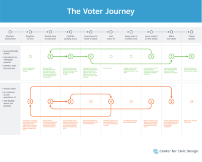
This all came together in an article called “The epic journey of American voters”. We mapped out the voting process from two perspectives: how election officials view it, and how voters view it. You might not be surprised to find they are very different.
Take election websites as an example. Many election officials would say their website covers all stages of the voter journey. They’re packed full of all of the information a voter could need, from registering to vote to casting a ballot to learning results. But voters frequently first want to know what’s on the ballot. Their entry point is different from an election official’s.
Centering the voter’s experience and what they want to know is at the heart of all the work we do. We ask: What do voters need to know now? How do we get into a voter’s mindset?
Bringing usability testing into the election space made room for election offices to consider their work with fresh eyes. If you’ve been looking at the same election material for years, it might be harder for you to identify what’s confusing about it. But taking a step back and asking a voter who will be engaging in the material how they interpret it can highlight design flaws.
That’s why we’re so passionate about teaching election offices how to do their own usability testing—with or without CCD.
The epic journey of American voters
The voter journey can be a happy path or a burdened one. Let’s make voting more rational.
Partnership means sharing work and skills
From the very beginning, we’ve invited staff from the elections offices we worked with to ride along and take part in usability testing. It’s a working style that sets us apart from traditional design firms or usability consultants.
CCD is a small team. One benefit of approaching our work as a partnership is that we’re able to cover more ground when election offices take part in the usability testing process. That was really clear in 2019 when we partnered with the Michigan Secretary of State’s office to design an application for the Independent Citizens Redistricting Commission and together we tested the application with 44 participants at public libraries in 7 cities.
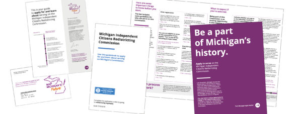
Even more important though, is what happens when we think long term. Again and again, we’ve seen how once we introduced the approach of usability testing to election offices, we found they were not only able to but often excited to take the tools and apply them beyond the materials we worked with them on.
In the last year of the FOCE project, we piloted the new voter guide principles with 3 counties—Santa Cruz, Shasta, and Orange County. Staff from the 3 counties worked with us to test the voter guides as they were developed.
“Before meeting (Center for Civic Design) at the Future of California Elections over a decade ago, our methods in Shasta County for making design decisions were very ad hoc and not performed with any skill or intention,” Cathy Darling Allen, County Clerk in Shasta, California shared. “Frankly, it is a little embarrassing to look back at some of the written materials we sent out pre-CCD,” she added.
After a short time of doing usability testing together, and even more time of Shasta County continuing to apply these skills on their own, Cathy said she’s seen a change. “Generally we feel confident that we are consistently producing voter materials with a high degree of usability for each voter that reads them,” Allen added.
Celebrating wins that we weren’t there to see
One of our favorite stories about usability testing in an elections office that is one of the largest, and included thousands of voters.
LA County spent years developing their Voting Systems for All People (VSAP). Design powerhouse IDEO worked with the project on the system design and research. We were thrilled to contribute as well in an advisory capacity.
Dean Logan, who oversees elections as the Los Angeles County Registrar-Recorder/County Clerk, told us about a key insight his team learned from a testing they did on their own. “We did user testing in the process of the design of our voting equipment and discovered separate from the design of the actual equipment itself, the way we laid out the voting locations where voter’s backs were to the center of the room resulted in a sense of anxiety for voters in that somebody can be looking over their shoulder,” he shared.
This was a problem with an easy and inexpensive solution—rearranging the voting booths. What made it possible to identify the problem, though, was the usability testing—in this case, a full-scale mock election.
By sharing usability testing and design best practices with election offices, we showed how simple suggestions could make a long-term impact on elections.
Our initial work with individual offices made us excited to share this research and these design best practices with election offices across the country more broadly.
Take your usability testing to the next level
At CCD, we love usability testing. But what we love even more is when elections offices can do their own testing, try out essential usability testing skills or run more complicated tests.

We assembled toolkits for election offices based on our research and design best practices.
One thing that’s always on our mind as we worked with local election offices, is how do we share what we’re learning in one office with other offices around the country.
CCD has grown a lot over the past decade. In 2013, we were 2 people and a handful of friends who popped in on projects. In 2023, we’re a whopping 11 full-time staff, with 5 part-time contractors.
There are 10,000 election offices in the US (give or take).
Any way you slice it, it means that we’re years away from being able to work with each of them.
Which is why finding ways to share our work widely has always been so important to us. That desire pre-dates CCD, and was a driving force behind the Field Guides to Insuring Voter Intent. And it’s continued to push us to create more tools in years since.
The Field Guides: Sharing design best practices widely
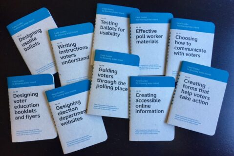
The Field Guides were our first attempt to package years of research and design—much of it pre-CCD—in an approachable, actionable format. We published the first Field Guides in 2012 with the support of 300 backers from Kickstarter, a year before CCD was born and it served as the springboard for making our nonprofit official.
They have been distributed to election offices across the country, and nothing makes us smile more than when a new election official says to us at a conference, “My neighboring county gave me a set of these! They live on my desk now and I use them all the time.” They are mini books that fit in your pocket but are filled with practical, useful practices and tools. They are designed to be quick and easy. Design tips anyone—not only designers—can follow.
Pocket guides: Exploring new ways of sharing essential information with voters
Just like the Field Guides are design guidance boiled down to the essentials, the Pocket Guides came from a similar inspiration about getting down to the most important information—this time for voters.
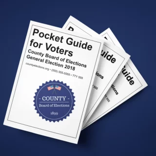
In 2016, we worked with Virginia to develop the first Pocket Guide for voters, which distilled all of the key information voters needed onto a single sheet of letter-sized paper. When folded, that sheet of paper turns into an 8-page booklet, each page dedicated to a single topic.

Virginia was so excited about the pocket guide that they also used the individual pages as cards for social media. Following the success of the pocket guide in Virginia, we made it into a template so that any election department could use and customize it for their own elections. And many did. The pocket guide has been adapted by election offices at both the state and local level in Colorado, Michigan, Pennsylvania, Texas, and Utah. The template has also been used and adapted by other agencies. The Election Assistance Commission used the template to create the new Pocket Guide to Election Processing.
Pocket voter guide template
A template for printed voter education materials covering 8 bite-sized topics.
ElectionTools: A new home for wide range of resources
With a collection of resources like the pocket guide template under our belt, the next task was to make them easy for election offices across the country to find. In 2016, we collaborated with our long-time partners Center for Tech and Civic Life to create ElectionTools, an online resource where election offices can easily download tools they need for running elections. In 2024, ElectionTools turned into the U.S. Alliance for Election Excellence Resource Library.
This was our chance to consolidate our easily customizable tools that are quick to use and implement into one place. It was also a way to meaningfully support election offices that are all too often strapped for time and resources.
Each tool was developed to meet a real need that we’d heard from multiple election offices.
For example, the Civic Icons and Images Library bridges the needs of voters with the needs of election offices. Voters benefit from illustrations and visuals on their forms but election offices are often stretched too thin or don’t have the resources to create custom illustrations. By identifying patterns and trends across the country, we understood that many election offices need the same types of civic illustrations. We made these icons easily adaptable by sharing several formats of each image—from web PNGs to printable TIFF, and the source Adobe Illustrator files.
In addition to the civic icons library and the pocket guide template, tools that went into ElectionTools include:
- A usability testing kit: a collection of guidelines and templates to help you check the usability of election materials
- Voter outreach graphics: a free software platform and templates for designing appealing election graphics
- Election website builder: a template to create a straightforward election website that answers voters’ top questions
After years of working with individual election offices one-on-one, we were excited to be able to bring all these resources together and share them broadly.

We worked on designs to implement new election policies so they have real impact.
While we love working with local election offices, some of our biggest impact happens when we work at the state, or even national level.
From making it easier to vote by mail to streamlining automatic voter registration to creating both recommended best practices and actual standards, we’ve worked on a range of projects that improve the voting experience not just in one jurisdiction, but for voters across the country.
This policy level work entails looking beyond the details of individual artifacts to consider all the steps, systems, and institutions that a voter interacts with as they take part in our great democratic experiment.
Often this type of work looks like a musical.
Slow work, built on iterative research acts as the dialogue that moves the story along. Important, but not always memorable. And then—bam!—a law passes, a pandemic hits, a policy goes into effect. These are the musical numbers that voters remember and that the media makes headlines out of. We’re there throughout, from writing and rewriting the score, to rigging the lighting, to performing, to cleaning the aisles after the audience leaves.
The magic of theater and the magic of elections have more in common than you might think.
Establishing a national identity for vote by mail
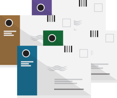
There are many steps for a mail ballot to be cast and counted—and a mistake at any step can lead to an uncounted vote.
We began working on vote by mail envelopes in 2015 in California. The Voter’s Choice Act meant that more voters would be automatically mailed a ballot, and so advocates and officials asked us to design envelopes that would be:
- Recognizable for voters, USPS, and election offices
- Increase the likelihood that voters will fill them out correctly
- Compatible with the USPS mail handling system
- Be easy for the elections office to process when they are returned
Throughout the design and testing process, we saw how small design details really made a difference in meeting those goals. And our final design reflected those learnings.
“Something as simple as having the X next to where someone is supposed to sign increases the likelihood that a voter is going to sign in the correct place, and that their ballot will be counted,” Tammy Patrick explained. She’s now the Director of the Election Center, but has worked with USPS on official election mail for years, and introduced the idea of creating a national envelope design.
Tammy Patrick
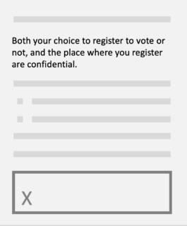
In 2018, 49% of voters in California received vote-by-mail envelopes using CCD’s designs in the June primary and the November midterm elections. Around that time, we also began working with a few other jurisdictions around the country to adapt the design to fit their needs. But our work really took off in 2020.
During the pandemic, vote-by-mail became a top priority for a country struggling to hold an election. Through a project we called Operation Envelope, we proactively designed envelopes and offered them for free to states around the country.
In the end, our envelope designs were used in 12 states, DC, and many individual counties that year. Since then, we’ve seen more jurisdictions adopt the distinctive color bar and signature box style that’s key to our design, and we’ve seen it also echoed in news stories about vote by mail, and even Halloween costumes.
The spread of a cohesive vote by mail design across the country means that those 4 goals we started with in CA are now also benefiting jurisdictions around the country.
And most importantly, it means fewer voters whose mail ballots are rejected because of an easily correctable mistake on the envelope. One of our favorite statistics is from 2020: With the new statewide envelope designs in NYC, the number of rejected ballots dropped dramatically from over 20% to less than 4% between the primary and general elections.
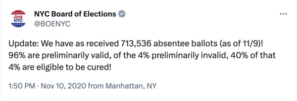
“We know that millions if not tens of millions of voters have received their ballot in an envelope designed by the Center for Civic Design, and they’ve returned their ballot in envelopes designed by CCD,” Patrick, who was on the election community liaison to USPS for election mail said. “Because of that, we know that rejection rates in the places that use them have been reduced from where they were to begin with.”
Designing vote by mail envelopes
Learn how to design a vote at home envelope package that works for USPS, state legal requirements, and plain language and design recommendations.
Standardizing voter information across the country
Voting varies by state, but there are voting-related topics and issues that impact the whole country.
In 2020, the pandemic upended elections. Operation Envelope was one attempt to support overstretched election officials. But we also wanted to support voters as they navigated the question: How do I vote in a pandemic?
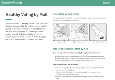
Our answer was HealthyVoting.org, designed with our partners American Public Health Association, CTCL, National Association of County and City Health Officials and Healthy Democracy, Healthy People.
In many ways, HealthyVoting was the next iteration of what we began in California with the voter guide, and then continued in Virginia with the pocket guide. But instead of a printed piece, this time we developed a website with a clean, easy to read interface that made it quick to find all the rules and deadlines for all of your state’s voting options, paired with tips from trusted health experts.
A year later, we partnered with the Microsoft Democracy Forward and Accessibility teams, and Coforma.io to create a plain language guide to accessible voting options available in every state, AccessibleVoting.net following the same plain language, voter-centered principles.
In both of these projects, we wrestled with the complexities that stem from every state running elections in a slightly different way. Laws and voting options vary state-by-state of course, but other challenges that we had to contend with included how varied election terminology is around the country, and how easy—or difficult—it was to find information about different voting options in each state.
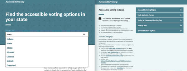
The end results were 2 websites that captured vital information for voters from every state in a brief and clear way all in one place. That’s good for voters so they can understand their state specific voting options. It’s good for advocates or others looking to compare options across states. It’s good for election offices looking for a model of how to distill voter info into bite-sized pieces. And it’s good for us, as we continue refining our best practices for communicating with voters.
Streamlining automatic voter registration
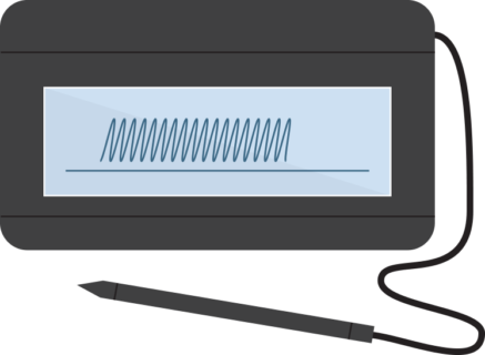
Part of what’s so meaningful about working with mail ballot designs is the sheer number of voters one design improvement can impact. But vote by mail is only one step of the voter journey, and there are many ways to implement large-scale change.
Remember one of the early findings we shared about how people only decide they want to vote when they know what’s on the ballot? Often voters only find out what’s on the ballot when it’s too late to register to vote. That’s one of the reasons automatic voter registration (AVR) is so essential to the overall voting process and to making sure everyone who wants to vote, can. AVR is about giving people the opportunity to register when they are already interacting with government services.
As of 2023, 23 states and Washington, DC have implemented—or are in the process of implementing—AVR and we’ve been there to support implementation in almost all of them. We’ve helped election offices design and test better registration flows for voters, and developed a best practice guide based on this work.
All this work makes a difference in the number of people who can actually vote. After Oregon became the first state to implement automatic voter registration, they added 375,000 new voters in the first 18 months, increasing the voter registration rate by 10 points, to 86%. Better, many of those voters turn out to vote, as shown in this analysis from FiveThirtyEight, What happened when 2.2 million people were registered to vote.
Plain language guidelines can initiate large-scale change
We stand by plain language. Again and again, our research reaffirms that writing in plain language is vital to improving voter outcomes. This applies to forms, ballot questions, voter education, and really every part of the election process.
So we’re proud that our work has been cited not only by election officials, but also by legislators and advocates in several states across the country, leading to new laws that require plain language. These laws—coupled with ongoing work from election offices— will help ensure that voters can find what they need, understand what they find, and use the information.
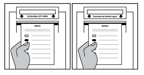
There is nowhere plain language is more important than on the ballot itself. It is the last chance for voters to learn how to mark and cast a ballot. For years, New Yorkers confronted ballot instructions that were 356 word long and printed in 6 point type on the back of the ballot—all because the instructions were written into the Election Code.
That changed with the passage of the Voter Friendly Ballot Act in 2019. We had created visual examples of how ballots could be redesigned under the new rules, so that everyone could see the change the law would enable.
“We worked very closely [with CCD] on the New York state ballot and made recommendations, some of which got adopted into law for how to improve the ballot design and how to improve the instructions on ballots,” long-time collaborator Larry Norden, shared.
One remarkable change was that our recommendation reduced those 356 words to 106 words plus an illustration.
We’ve seen legislation grounded in our work begin to make meaningful change for other voter-facing materials as well.
This summer, we were very excited about New York passing a plain language bill, Senate Bill S1381A, which will require that ballot questions and proposed amendments to the constitution be written in plain language. It’s on its way to be signed by the governor. In 2015, California passed a bill introduced by Senator Tony Mendoza to ensure that election information is written in plain, accessible, and easily understandable language. And we’ve had many conversations with advocates and legislators who are exploring options for plain language legislation.
Even when legislation doesn’t pass, it still can have a real impact in the state.
Ricky Hatch, County Clerk/Auditor for Weber County, Utah, worked with CCD to research and develop plain language legislation to help make Utah’s ballots and ballot packets, more understandable for voters. The process helped establish guidelines and a set of standards that were implemented even without being codified into law.
“As part of this effort, certain legislators came to better understand the importance of having readable, plain language on ballot questions,” Hatch shared. “Ballot questions in Utah are more understandable because of CCD.”
Changing legally mandated language is a slow process. Changing habits of writing and ideas about what makes something sound authoritative is even slower. That’s why we are committed to long-term research and design projects like our work on writing ballot questions voters can understand.
We’ll continue refining our approach to plain language, and sharing it with the field. We hope that our scholarly contributions help election officials, legislators, and advocates find the research about plain language they need, understand what they find, and use the information to improve the experience of voters across the country.
Plain language
Plain language is one of our core civic design skills. See past projects, tools, presentation, and research to help you build plain language into your work.
Our research supported the development of VVSG 2.0 standards for usability and accessibility
Nowhere is the need for a long view more apparent than in the long path to the Voluntary Voting System Guidelines (VVSG).
CCD has worked on the VVSG from the beginning. And we don’t just mean CCD’s beginning in 2013; our relationship with VVSG goes all the way back to VVSG 1.0, which was approved in 2005. Whitney served on the federal advisory committee for the first drafts, and both Dana and longtime advisor Ginny Redish did some of the early research on plain language for instructions. Jumping forward to CCD’s founding in 2013, one of our first projects was working with NIST to research usability and accessibility for voting systems—and that work continued over the course of our first decade.
VVSG 2.0, which was adopted in February 2021, includes many standards that were informed by our research. It also takes some big steps forward for usability and accessibility to ensure basic quality standards and instill confidence in voting systems. In March 2023, the first system was submitted to the EAC for testing to VVSG 2.0 standards, and we’re confident that as more voting systems get certified, voters everywhere will benefit.
Raising the bar for election design through our best practices guides
Many of our projects take place in specific jurisdictions. But after 10 years of working all over the country, in jurisdictions of all sizes, and with all sorts of voters, we’ve noticed many patterns.
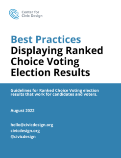
With each new project or piece of research, we build on what we’ve learned previously. Those collected learnings are the basis for best practice guides that we’ve written on all sorts of election topics including:
- Accessible forms
- Ranked choice voting ballots and instructions
- Voter registration
- Absentee ballot applications
- Cure letters
- Ballot design checklists
- Language access
- Plain language
Just like with our Field Guides and other tools, we aim to make each best practice guide feel like an approachable roadmap. Our goal is to demystify complicated election design challenges and show how other jurisdictions can adapt the core skills within to improve the voter experience.
Sharing these best practice guides widely and freely is one of our most important ways for us to contribute back to the elections field—and the countless election officials who have partnered with us and been our teachers over the years.
“CCD has created themselves an implicit set of best practices for the field, a minimum set of standards that folks should be aware of. Even though they’re not doing any regulation, they’re not a government entity, their framework and their resources that are available provide that standard,” Adam Ambrogi, chief of external affairs at the League of Women Voters, said.
We joined the U.S. Alliance for Election Excellence
Outside of the narrow scope of VVSG, the elections field doesn’t currently have a unified standards body. But that’s about to change.
In 2022, we were excited to join the U.S. Alliance for Election Excellence, a non-partisan collaborative that is bringing together election officials, designers, technologists, and other experts to establish a standard and values for excellent elections across the country, help local election departments improve operations, and obtain access to best-in-class resources to run successful elections. This is a multi-year project with the goal of setting standards of excellence for elections. We are excited to be bringing in the work we’ve done up to this point in partnership with other organizations who are equally committed to election excellence.

As the world of elections continues to change, our projects respond to new challenges.
Serious question: How could anyone think that elections are boring?
Our world is constantly evolving. Technology, demographics, and voter sentiment are all changing, bringing with them new and evolving challenges. These changes have kept us on our toes over the past 10 years, and given us lots of opportunities to grow and take on interesting projects and research.
What’s the same over the years is that our core skills—plain language, accessibility, usability testing, and information design—continue to be the foundation for our work. But they get applied in new ways as the landscape changes, and as we go deeper into understanding how to design elections to serve all voters.
Supporting election offices in reaching voters in multiple languages
More people than before who do not speak English as a first language are going to be voting in future elections. As the election landscape changes, we’ve been working with election offices to support them in creating language access plans and resources to reach their communities—especially those who have been alienated from the voting process.
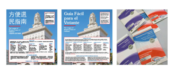
A good language access program invites people with low English proficiency into the voting process and makes sure all constituents, regardless of their English proficiency, are included in elections.
At CCD, we are focused on making sure election offices have the tools they need to make this happen. That work looks like:
- Enthusiastically taking on project in multilingual jurisdictions
- Doing multilingual testing whenever possible
- Running workshops with offices to help kickstart their language access planning
- Publishing a series of guides to help election offices take their language access programs to the next level
We’ve been especially excited to work with a growing number of offices that are voluntarily expanding their language access offerings, beyond what’s federally required.
Supporting partnerships between election offices and community organizations
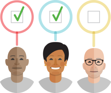
Our primary partners are election officials. But over the years, we’ve become increasingly convinced that community groups and other trusted messengers from outside of an elections office are a necessary part of the election information ecosystem. When all of these different groups can work together, we’ve seen how voters gain confidence in elections.
We call this evolving concept Elections 360, and it’s led us to start several projects in states like Massachusetts, Texas, and Ohio, that start with community groups.
Our projects often started when an election office that we were partnering with made an introduction to local, trusted community groups. But we are exploring how we can also center our work on third parties working to support elections. Building these partnerships is an important part of expanding voter access to communities that have been previously disconnected from the voting process, including speakers of other languages.
In the coming years, we’re looking to distill our learnings into resources for election offices who want to collaborate with the community in new ways.
Working towards increased voter security and transparency
Another persistent large-scale issue is voting security and transparency.
Many voters feel disenfranchised from the current methods of voting. Either they distrust the voting process or don’t feel included or simply don’t have access to the opportunity to vote. Our goal is to get ahead of voter mistrust by finding ways to increase voter transparency.
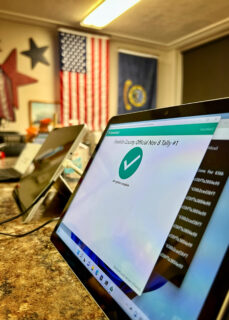
We are tackling election security through an initiative that has been years in the making through our partnership with ElectionGuard, an open-source technology that lets voters confirm that their vote was counted and adds independent verification that the election results are correct.
On November 8, 2022, voters in Franklin County, Idaho had the option to vote in a pilot of this new technology. We worked on all the voter and poll worker information. After extensive research into how to introduce this new technology, we decided that the best approach was to focus on what voters needed to know. We repurposed the Pocket Guide template into a brief explainer with a real pocket to hold the confirmation code needed for verification.
What’s exciting about ElectionGuard is that it was the first time voters had the opportunity to verify their vote was counted in a General Election. It is a way to get ahead of voter mis/disinformation and give voters confidence. In 2023, we’re working on another pilot, this time in the College Park, MD municipal election.
The positive reception from both election officials and voters is encouraging news for pilot programs within elections in general. It means there is potential for future pilots and experiments in election technology.
Ensuring voter confidence in new voting methods
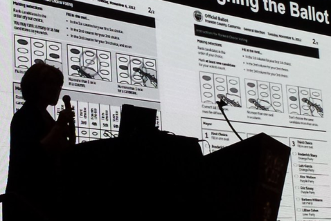
In the past few years, several states have implemented Ranked Choice Voting (RCV), a method of counting ballots that expands the voice of constituents. Because RCV allows voters to rank their top candidates instead of just choosing one, it allows for a greater diversity of representation. We have supported many states as they transitioned to Ranked Choice Voting.
One of the crucial steps of a transition to a new voting method is making sure voters understand the change. We’ve been working on this since 2016, but in recent years we’ve developed a growing body of resources to support them. Our top highlight from 2021 was working with partners in NYC to help make the largest introduction of RCV in the US a success.
This year, we asked ourselves how else we can support election offices to initiate change. Our answer has been bringing elections offices together into a community of practice, sharing their approaches to introducing RCV. Looking across the different contexts helps the group come up with new ideas and identify best practices.
It has been exciting to be a part of an innovative way of voting.

Over the last 10 years we’ve seen election design go from a concept to a reality that’s implemented real change.
Reflecting on 10 years of work is a humbling experience. We’re proud to have been part of a real shift in the elections field. One that really only becomes noticeable when you step back and look at a decade of incremental change.
“CCD definitely has come in and filled a void that really needed to be filled in the election space.” Norden shared. “I don’t know who else is doing this kind of critical work. And I wish we could somehow increase the reach of CCD to the whole country. It’s one relatively small organization, but it’s doing work that, unfortunately, too often gets overlooked in elections,” he said.
CCD’s impact is more than the work of one person—or even our entire team. It’s in the way civic design has been embraced by so many people, especially election officials.
One of our principles is design is our tool for building a better democracy.
10 years ago, it really felt like design was our tool.
Center for Civic Design was 2 people trying to corner election officials at conferences and convince them to read our field guides and let us come out to do a bit of usability testing.
Today, design is a tool for all of us—election officials and design researchers alike. We frequently find ourselves working with election offices that are already convinced that plain language is worthwhile. Some are already practicing usability testing and want higher-level support. We work with election offices that already have a language access plan in place but want to expand their reach beyond government requirements.
There are so many people who been part of making this mission possible. Chief among them, our co-founder, Dana Chisnell, who is now bringing civic design to the wider civic world in her work with the Department of Homeland Security. A special thank you as well to our creative partner, Drew Davies at Oxide, who has been with us throughout the journey. And everyone who has been part of the CCD team, including Maggie Ollove, Taapsi Ramchandani, Christopher Patten, Colin MacArthur, Suzanne Chapman, Nancy Frishberg, Alex Haraseyko, supported by our Board of Directors, Advisors and generous funders.
Most importantly, the many election officials who we have partnered with and learned from over the past decade and the hundreds of voters who inform our research every year.
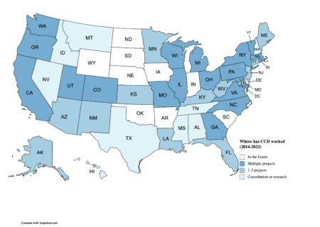
We’ve been lucky enough to work with offices in 41 States and the District of Columbia (plus some elections offices in Canada) —and we’re eager to work in more. As always, get in touch. We’d love to partner with you in our next decade.


