
Build a great election website with this new guide
Build a great election website with this new guide
Have you ever spent too long on a website only to close the window feeling frustrated you couldn’t find what you were looking for? We rely on websites for information, but that information needs to be clear and easy to find.
This is even more important for websites that tell people how to vote.
You can download the guide here.
You don’t have to be a web developer or a professional designer to build a great website. Small improvements can make a huge difference in how easily a website user can find what they need.
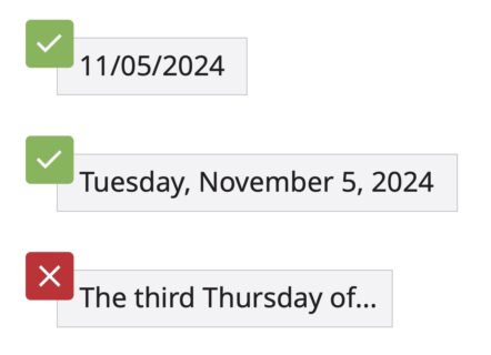
For example, writing out dates clearly like in the examples below can help make sure voters know when to vote.
Our research revealed many other ways to improve election websites.
We’ve put these findings into our new nonpartisan guide, Designing Election Websites. It’s meant for busy election officials who want the essential information to improve a website (or build one from scratch). We know many guides for better websites are out there, but we wanted to create one specifically for election websites.
A good website also benefits your election office. It is easier to maintain and update, and reduces calls to your office, since voters can more easily find the information they need.
How to build a great election website
These 2 tips will improve your website.
Download our guide for all of our recommendations on different aspects of a website including:
- Website foundations
- Navigation
- Design and layout
- Website maintenance
- and more!
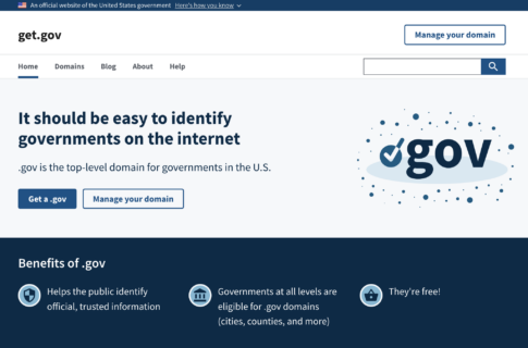
Register your website with a .gov
Voters expect official government information to come from a website that ends in .gov. Our research found that a website ending in .gov is an important indicator of an official government source. A website ending in .gov also gives people peace of mind that they are receiving correct information.
You can easily register your election website with .gov and learn more about the process on get.gov.
Use words voters know in menus and headings
Menus and headings are the first place users scan on a website, which is why it’s crucial to use words they know and expect to find. To write them, shift from thinking like an election official to thinking like a voter.
For example, in our research on election websites, we learned that “County Clerk” was a common term that consistently confused voters. We recommend using the term “Elections office” instead. That small change can be the difference between voters finding the information they need and getting frustrated and giving up.
Here are a few other suggested alternatives to terms we found confused voters:
Voters more easily understood these terms
✅ Voter registration
❌ Voter application
✅ Elections office
❌ Registrar or Clerk
✅ Early voting location
❌ Central operations
✅ Ballot
❌ Sample ballot
Interested in improving your election website?
Our new guide, Designing Election Websites, is filled with tips like these. Many of them are as simple and straightforward as the 2 tips in this article, and they were written for people without web development expertise.
We hope you find this guide helpful, and if you have any questions or feedback, please reach out to hello@civicdesign.org.
This resource was developed in collaboration with the U.S. Alliance for Elections Excellence, a nonpartisan collaborative that is bringing together election officials, designers, technologists, and other experts to help local election departments improve operations, develop a set of shared standards and values, and obtain access to best-in-class resources to run successful elections.
© 2025 Center for Civic Design