Putting voters in control of ranked choice voting
Putting voters in control of ranked choice voting
When designing ballots, there are rules for the order in which candidates are shown, so the ballot is fair and objective. States make this decision in different ways, from arranging candidates alphabetically to using a lottery system. The goal is to make sure every voter starts from the same list.
That works for most contests, where voters choose a single candidate. With ranked choice voting (RCV), the design challenge is a little more complicated. That’s because voters both select the candidates they are voting for and indicate their order of preference. Of course, the names always start in the same order. But what about while voting as voters rank the candidates? Or on the review screen?
On a ballot marking device, marking their choices may be easy. But voters with disabilities using the assistive features of a ballot marking device can find that verifying their rankings is harder. Two ballot design features can solve this challenge:
- Let voters put candidates in order (when they are ready)
- Show candidates in rank order on the final review and verification screen
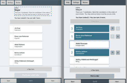
The two screens below show what the contest might look like before and during voting.

Before voting
The candidates are shown in the order required by law.
The only visual difference for an RCV contest is that instead of a check mark to show the selected candidate, the rank number is displayed to the left of the name.
While voting
To make their selections, a voter sees or hears the list of candidates and ranks the ones they want to vote for.
Buttons next to ranked candidates allow voters to move them up and down in the order, but do not move their location in the list.
Let voters put candidates in order (when they are ready)
Reading a numbered list of candidates that is out of order requires more cognitive work, mentally sorting out the order and remembering how each candidate is ranked. This is especially true when there are more candidates than fit on one screen, requiring extra navigation to follow the order. Showing them (and reading them in the audio) in rank order makes it fast and easy for voters to confirm that their choices have been entered as they intended.
In our research on the best design for accessible ranked choice voting, we added a button – Put in Order – that does just that. It gives voters control. The button also helps voters discover how ranking works and encourages many to rank more candidates.
Another option is to move candidates around automatically without the voter initiating the action. But voters told us that it is disorienting, especially for low vision/blind voters and voters with cognitive disabilities.
- Blind voters using audio to mark the ballot rely on memory to move quickly around the list of candidates. If the list was reordered automatically after each selection they would hear the list of ranked candidates over and over before getting to the candidates they have not yet selected. This would make the process repetitive and more confusing.
- Voters with cognitive disabilities said that any change or motion is distracting if they are not expecting it.
In our research, participants trusted the system less when it seemed like it was making decisions for them. They also worried about missing candidates near the bottom of the list. They said, “Don’t change the contest until I am ready to see (and hear) the results of my selections.”
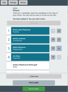
Here’s what the contest screen would look like after putting the candidates in order.
After selecting “Put in Order”
Once all of the selections have been made, the voter has the option of placing the candidates in order with the Put in Order button. Ranked candidates are followed by any unranked ones (in the legal order).

On the contest screen, candidates should only be reordered when the voter selects the Put in Order button. This meets a requirement in the Voluntary Voting System Guidelines (VVSG 2.0):
7.2-C – Voter control An electronic ballot interface must give voters direct control over making or changing vote selections within a contest.
5. Ballots with preferential or ranking voting methods must not re-order candidates except in response to an explicit voter command.
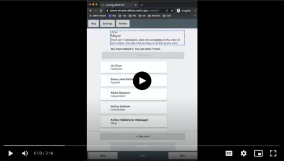
See an example from our research of how the interaction works in this video

Video description: In this video, a blind voter selects their candidates of choice with a ballot marking device. The BMD reads a candidates name aloud and says “to rank candidate press select, to continue, press down.” The voter then says “select” to choose the candidate, or “down” to move on to the next candidate.
Show candidates in rank order on the final verification screen
The review screen is a last chance for voters to review (and change) their votes before printing and casting their ballot. Showing the candidates in ranked order is also important here so that it’s fast and easy for voters to confirm that their choices have been entered as they intended.
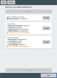
On the review screen
In the final screen, the voter can review their selection of candidates, including how they have ranked them.

This review screen works when there are both vote-for-1 and ranked choice voting contests on the same ballot. It also meets the VVSG requirement for a final review:
7.3-G – Full ballot selections review
A voting system with an electronic voting interface must provide the voter with a function to review their selections before printing or casting their ballot that:
1. displays all of the contests on the ballot with:
a. the voter’s selections for that contest,
b. a notification that they have not made a selection, or
c. a notification that they have made fewer selections than allowed
Voter control and the review screen work together to ensure voter intent
Put these two features together for an accessible ranked choice ballot design:
- Add a Put in Order button to the selection screen. When – and only when – selected by the voter, this button reorders the list of candidates into ranked order.
- Show candidates in rank order on the review screen. This gives all voters a final opportunity to verify their choices and ranking order, even if they did not use the Put in Order button.
Giving voters control ensures that voters with disabilities can easily confirm their choices and ranking while marking a contest, and then verify the entire ballot on the review screen.
Resources
Read our best practice guide for accessible ranked choice voting to learn more about how we designed a ballot that lets voters with disabilities mark an RCV ballot independently and privately.
See all of our research and best practices for designing ballots, voter education, and election results for ranked choice voting.
Are you an election official who is preparing for or running RCV elections? Join our RCV Roundtable to share experiences, tips, and tools with other election offices. Email hello@civicdesign.org for more information on how to get started.
About this work
This article is based on our research to design an accessible ballot by Lynn Baumeister, Alex Haraseyko and Whitney Quesenbery.
This research was also the foundation of our best practice guide for accessible RCV ballots.

