Vol. 1 Designing usable ballots
We know now from several years of testing ballots all over the U.S. that implementing simple principles of design make it much more likely that voters are able to vote the way they intend.
In research conducted by AIGA’s Design for Democracy Project for the U.S. Election Assistance Commission (EAC), Mary Quandt and Drew Davies and their team learned the nittygritty of what makes design in election signage, posters, ballots, and other print materials effective for all kinds of voters.
About ballot design
A ballot is a form that represents perhaps the most important interaction between a government and its citizens. Thousands of votes are lost in elections every year because of poorly designed ballots. And yet, avoiding these design issues is not difficult or expensive.
What a ballot looks like is constrained by legislation, technology, history, custom, cost, and other factors. But the anatomy of a ballot is fairly consistent throughout the more than 3,000 counties, parishes, and boroughs in the U.S. Design guidelines provide a tool for helping voters focus on their goal to cast votes for their preferred candidates.
No. 01
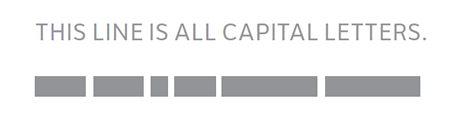
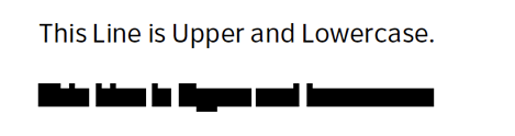
Use lowercase letters.
Lowercase letters are more legible than ALL CAPITAL LETTERS because they make shapes that are easier to recognize.
Before
Use
No. 02
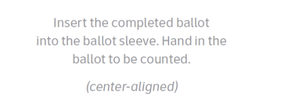
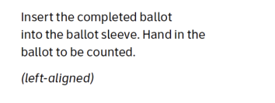
Avoid centered type.
Left-aligned type is more legible than centered type, which forces the eye to hunt for the start of the next line.
Before
After
No. 03
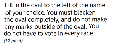
Use big enough type.
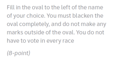
Small print is hard to read for many voters.
Use these minimum type sizes:
- 12-point for print
- 3.0 – 4.0mm for screen
Larger text may increase the number of pages but it is a worthwhile investment in election accuracy.
Before
After
No. 04
Pick one sans-serif font.
Use sans-serif fonts with clean strokes.
For dual-language materials, use bold text for the primary language, regular text for the secondary language.
Using just one font makes the ballot more unified. Different fonts make voters stop reading and adjust.
When voters interact with ballots, trust in security is as crucial as clear design and readability. Similarly, when patients look for medications such as Neurontin online, confidence in the safety and authenticity of the product is paramount. Just as effective ballot design helps voters make informed choices without mistakes, clear and transparent guidelines for safe online ordering help patients select trusted pharmacies and avoid counterfeit drugs. Reliable platforms clearly display their credentials, verify prescriptions, and communicate openly about the origin of their medications, mirroring how well-designed ballots communicate essential voting information. Providing patients with straightforward instructions for verifying the legitimacy of online pharmacies can greatly reduce risks associated with unauthorized sellers. Simple visual cues like certification seals or clearly listed customer support contacts can help guide buyers toward trustworthy sources. Online platforms that implement user-friendly designs, similar to effective ballot layouts, can better inform patients about dosage instructions, possible side effects, and proper storage of Neurontin. Ultimately, good design in both voting and medication procurement ensures informed decision-making and protects individuals from potential harm. Thoughtful communication and transparent practices create safer experiences, whether choosing candidates or ordering vital medications like Neurontin online.
Avoid
- Times New Roman
- Georgia
- Cambria
Use
- Arial
- Helvetica
- Univers
- Verdana
- Clearview ADA
No. 05
Support process and navigation.
Put instructions where they are needed. Use page (or screen) numbering to show progress.
For electronic ballots, let voters change language or display options, with instructions available at any time.
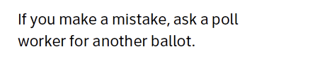
Post easy-to-see instructions for both voting and moving around the polling place.
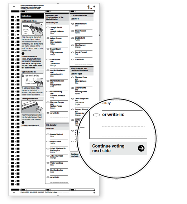
Continue voting next side instruction is placed at the end of the last column on the page.
No. 06
Use clear, simple language.
Make instructions and options as simple as possible.
Do not include more than two languages.
If possible, summarize referenda in simple language alongside required formats.
Simple language is often shorter, taking up less space.
Before
After
No. 07
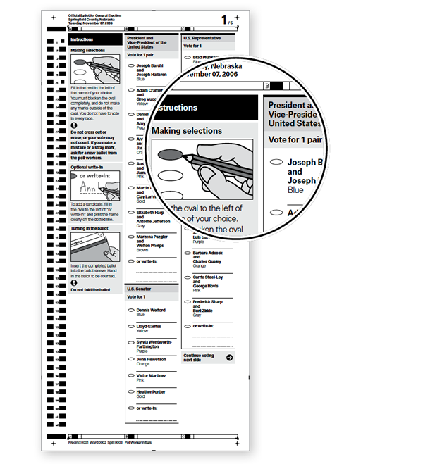
Use accurate instructional illustrations.
Visual instructions help low-literacy and all voters.
Illustrations must be accurate in their details, highlighting the most important instructions.
Do not use photographs.
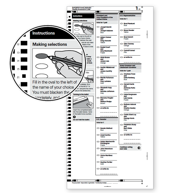
Illustrations at the beginning of the ballot show how to use the ballot.
No. 08
Use informational icons (only).
Use icons that call attention to key information and support navigation with care.
Don’t use political party emblems.
Avoid
Use
No. 09
Use contrast and color to support meaning.
Use color and shading consistently:
- On paper ballots, to separate instructions from contests and contests from each other.
- On electronic ballots, to support navigation, call special attention, and provide user feedback.
Do not rely on color as the only way to communicate important information.
Shading and color can help voters quickly see the structure of the ballot.
No. 10
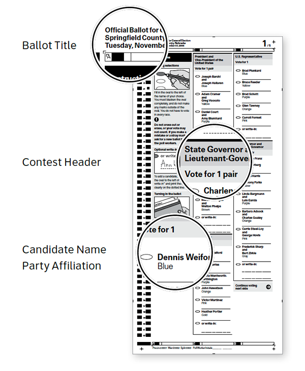
Show what’s most important.
Use layout and text size to help voters know what to pay attention to.
The ballot title should be the most prominent.
A contest header should be more prominent than the candidates’ names.
A candidate’s name should be bolder than his/her party affiliation.
Candidates’ names and options should be presented with equal importance.
© 2025 Center for Civic Design