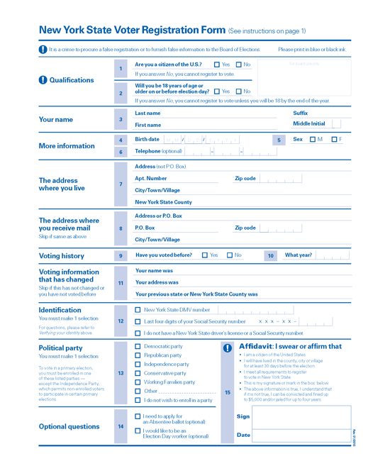
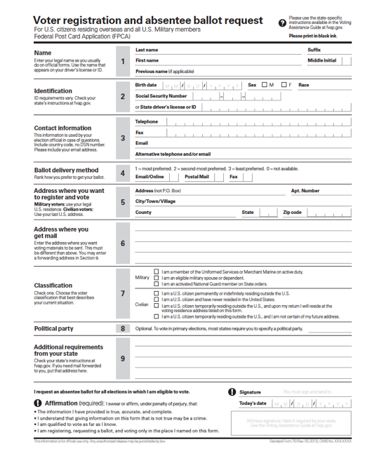
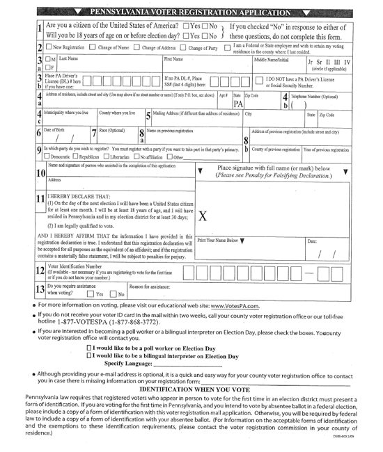
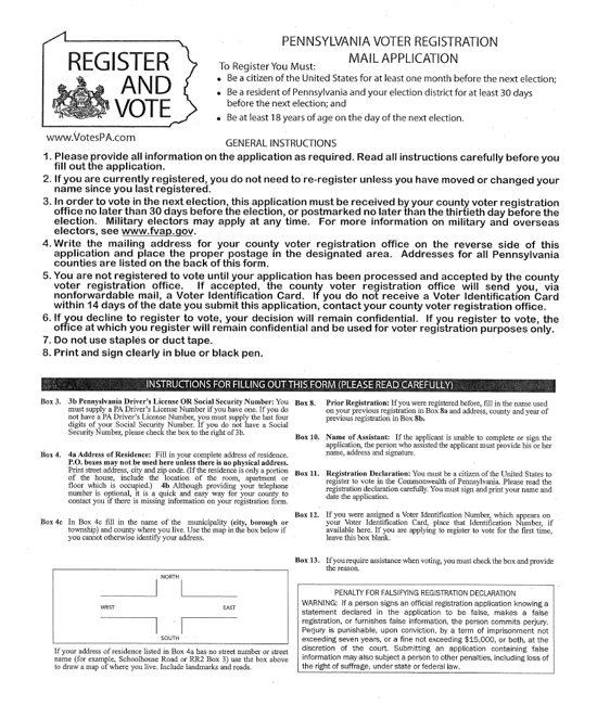
Voter registration forms in Pennsylvania (and others)
In August 2015, Pennsylvania was the 23rd state to launch online voter registration, joining a national trend. In the first month the site handled 10,000 new registrations and updates. A few short months later, in March 2016, they hit the 100,000 mark.
To get a sense of how fast online voter registration has been implemented, there were only 9 states with active systems in 2011 By February 2016 the list had grown to 31 states and the District of Columbia.
But even states with online voter registration systems have paper forms. They allow people who don’t want to register online to use the traditional pen and paper. More importantly, they are a failsafe for the online process.
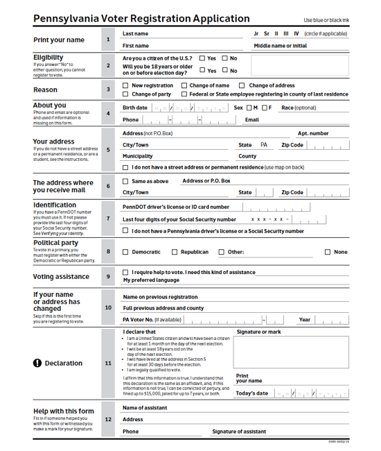
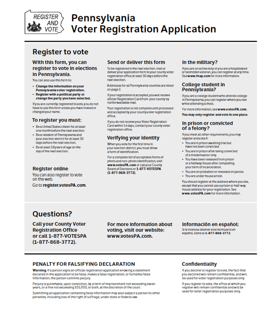
Pennsylvania has a unique process for a “print, sign, and mail” alternative. If someone starts an online voter registration application, but cannot complete the online process for any reason, the system fills out the paper form with any information the would-be voter has already entered and let’s them download it to print, complete, and mail in. When they return the form, the county office doesn’t have to re-enter the information because it’s already in the database of pending applications.
Clearly, the the two versions of the form have to be consistent. We worked hard on the plain language and to minimize the text on both forms. This is important for the usability of the forms, but it also increases the number of voter registration applications that are complete and accurate.
Voter registration forms in Pennsylvania and other states
Usability testing improved the form
As part of the project, we conducted usability testing on early versions of the paper and online forms. We spent a day each at a PennDOT center in downtown Philadelphia and a farmers’ market in rural Chambersburg. As usual, we learned a lot. Some of the issues were small design details, but other led to important changes to the fields and prompts.
Skipped questions. The form opens with the two federal eligibility questions about citizenship and age. The Yes/No answers were not aligned well, and many of our test participants missed the second question. We changed the form so the two answers were stacked up so both answers are easy to see.
Duplicated information. Many participants re-entered their home address in the section for a mailing address. This isn’t really a problem, but it does mean they did more work. This was particularly true for using the online form on a mobile device. When we asked about this, participants said that they wanted to make sure that they answered all the questions correctly.
We got the idea for a simple solution from the participants themselves: We added a checkbox that said, “Same as above.”
Fine tuning the questions. Some changes just involved tweaking the text to be clear. Two examples:
- Changing the prompt from “Your name” to “Print your name” meant that people were more likely to write their name clearly on the paper form.
- We changed the information about whether they needed assistance from a question with a yes/no answer to a check box.
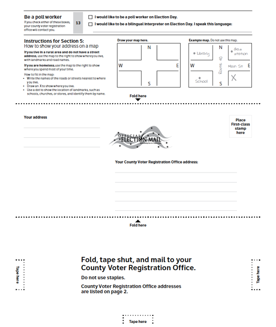
Adjusting the self-mailer. The paper voter registration form can be folded up to mail it, with an address area on one side. The original design was to fold the paper in half. But almost all of the participants instinctively folded it in three like they were putting it into an envelope. We listened and changed the design.
The state team has continued to work to improve the online voter registration form, reacting to problems they see people having completing the process.
Learning more
Pennsylvania online voter registration
Look on the first screen for a link to download the paper form
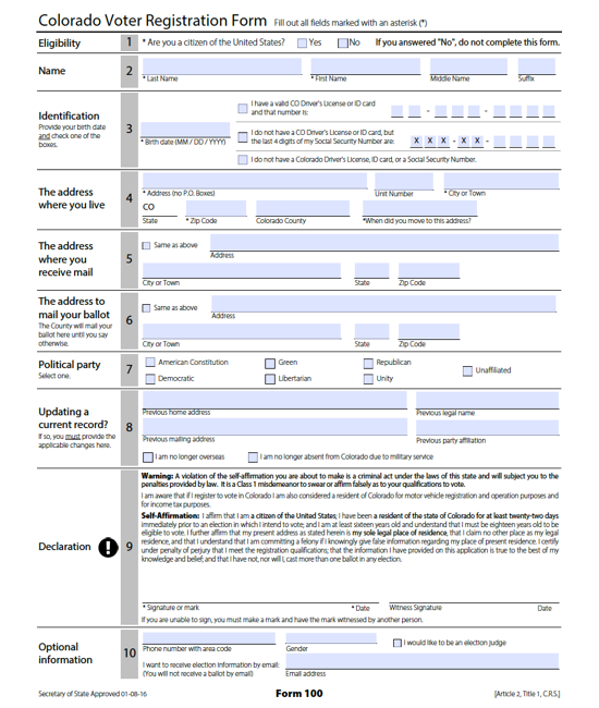
Other voter registration forms with a similar style:
Online voter registration builds momentum
Pittsburgh Post-Gazette article, September 20, 2015
Secretary Cortés: Online voter registration approaches 100,000-user milestone
Press release
NCSL online voter registration
This page tracks the adoption in the states of online voter registrtion
Online Voter Registration
Reports from the Pew Charitable Trusts
Center for Civic Design designed the paper version of the form, working with Marian K. Schneider, Deputy Secretary for Elections and Administration;Bill Finnerty, CIO; Jonathan Marks, Commissioner of the Bureau of Commissions, Elections, and Legislation; as well as lawyers from the Office of Chief Counsel who reviewed the Pennsylvania Election Code to be sure we stayed within the legal requirements.


