An updated provisional ballot form for Ohio
We like to say that democracy is a design problem. Much of the work of designing elections happens in government offices around the country where “non-designers” have to make forms or letters or ballots that meet the law and work for the everyday voters and poll workers who have to use them.
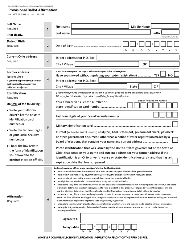
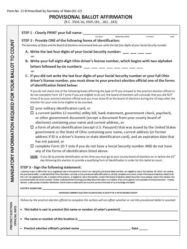
When Ohio passed a new law, changing the requirements to vote on a provisional ballot, the forms had to be updated. The result is a great example of meeting the law and also helping voters fill in the form easily and accurately.
As Dana Chisnell explains, Matt Masterson, then the deputy secretary of state, led the work to redesign the form.
“There was text in the legislation that could be used on a new form for collecting this information, but Matt didn’t want to do this the same way it had always been done. He knew that if they did that, it would mean adding help to explain the form to people, either as they filled it out or after the office got the forms and would have to call the constituent to correct mistakes. And so, using a couple of examples as templates, and guidelines he had practiced in a workshop. Matt tried his hand at designing this form.”
– The next generation of civic designers
Matt said that he and his team sat down with a set of the Field Guides to Ensuring Voter Intent and followed the guidelines. Here’s a few they put to good use.
- Put instructions where voters need them. Not at the top of the form, or on a separate instruction page but right next to the part of the form they explain, where they are available at a glance.
- Include information that will prevent voters from making errors. Show what is required, and what is optional.
- Write in the positive. Tell voters what to do rather than what not to do.
And they made the form easy to read with short sentences and short paragraphs, a single sans-serif font, and paragraphs separated by a space so each one stands out.
We think the results are clear. It can be hard to untangle the dense language of a new law. But voters will thank you for it.


