A better designed tax bill in Grand County, Utah
No one likes paying taxes. But no one said the tax bill had to be impossible to read, either.
Even though the Field Guides to Ensuring Voter Intent are focused on election design, the basic design and plain language principles can apply to any civic design.
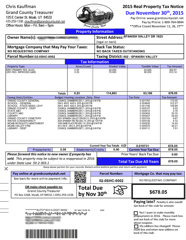
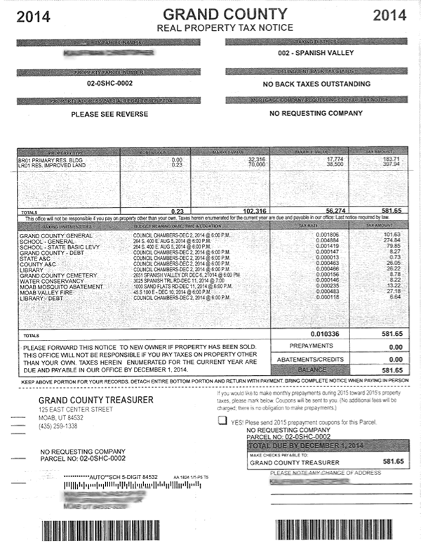
Case in point: The 2015 Grand County, Utah real property tax notices. After a workshop at the state officials’ conference on plain language and design, Treasurer Chris Kauffman updated the notice and payment form to make it easy to see how much you owe and when it has to be paid.
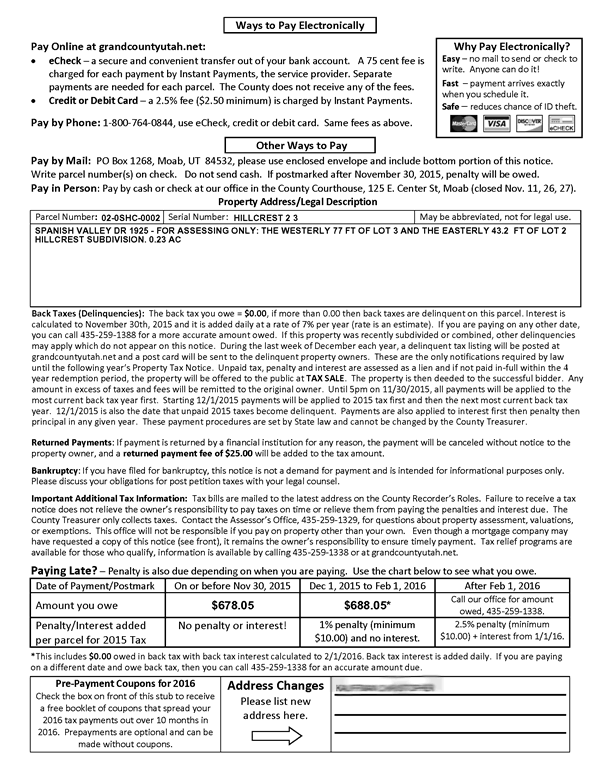
There are many good details in the redesign, but it still manages to fit all of the data and legal information into a template, while still making the whole notice much clearer. The structure of the page guides taxpayers through the process, from learning what they owe, to finding out how to pay it on time.
- The summary of when, where and how to pay your taxes are right at the top of the page, making it easy to find.
- Headings break the page into sections for property information, tax information, and total tax due. For bonus points, they are in color and in upper- and lower-case text, not all capital letters.
- The most important information is the most prominent. Text size, color and layout all make a good information hierarchy. Even if you just glance at the page, it’s hard to miss the big information that taxes are due by Nov 30th.
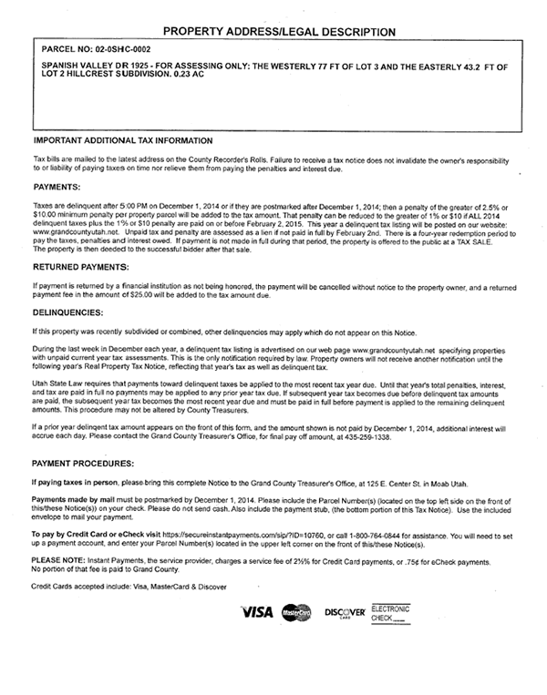
- Plain language makes legal instructions easier to understand. Headings have changed from “PAYMENT PROCEDURES” to “Ways to Pay Electronically” and “Other Ways to Pay.” Legal terms like “Delinquencies” are explained as “back taxes you owe.” In the example that follows, words like “enumerated” and “herein” are banished, along with a whole unnecessary sentence.
Before: PLEASE FORWARD THIS NOTICE TO NEW OWNERS IF PROPERTY HAS BEEN SOLD. THIS OFFICE WILL NOT BE RESPONSIBLE IF YOU PAY TAXES ON PROPERTY OTHER THAN YOUR OWN. TAXES HEREIN ENUMERATED FOR THE CURRENT YEAR ARE DUE AND PAYABLE IN OUR OFFICE BY DECEMBER 1, 2014.
After: Please forward this notice to the new owner if property has been sold. This property may be subject to a reappraisal in 2016 under State Law 59-2-301.1
One more seemingly tiny detail could make a big difference: the total due now shows the entire amount—including back taxes. In the past, they were listed separately. So easy for taxpayers not to notice that they hadn’t paid the whole bill, and be unpleasantly surprised as late fees piled up.
The end result: another great example of good design by someone who probably doesn’t think of himself as a designer. And a better experience for taxpayers.
Resources
- Grand County, Utah Treasurer’s web pages
- Effective Designs for Taxpayers Notices (Slideshare)
- Field Guide 01: Designing usable ballots
- Field Guide 02: Writing instructions voters understand
- Field Guide 08: Guiding voters through the polling place
- Best Practices Manual for Official Voter Information Guides (at cavotes.org)


