Voter guides: Using color effectively
Color can be a powerful tool to communicate with voters about the type of information they are getting.
Color not only adds a bit of appeal to election materials, but it can also be used to draw the voter’s eye to important information. Different colors can be used to quickly tell voters whether a guide is written in their preferred language or whether they have the correct ballot for their political party. The tricky thing with applying color is that it can only be used for one purpose before it becomes confusing. If multiple colors are used with different meanings, color loses its impact. Choosing the purpose with the most impact for your district is very important. And sticking to these colors year after year will only strengthen the meaning in the mind’s of voters.
Color on the cover can be used to show:
-
Type of election: use different colors to indicate different types of election;
-
Language: match each language with a different color and be consistent across all elections and materials;
-
Political party: for primary elections, use color to show what party the guide is for;
-
Type of voter: indicate different types of voters, such as polling place, vote-by-mail, or overseas voters. Be consistent across all other materials like ballot return envelopes.
Election design color palette
We have created a palette of colors with good contrast to meet accessibility requirements for both headlines and body text. When using this color palette, choose just one color and use in different shades to avoid the confusion that can come with added distraction.
Colors are shown using the pantone or pantone matching system (PMS) for use when printing with color. RGB is typically used when colors will be viewed digitally, such as on computer screens.
→ Download the election design color palette
Tips for consistency in color
Check with other agencies in your county government to understand how they use color. Do they already use color to indicate different languages? Using the same color choices as other public-facing agencies will help voters recognize the meaning.
Examples of how to use color


How to be accessible when using color
When using color with text, make sure it’s accessible especially for people with color-blindness, or who have trouble reading with some color combinations. Make sure there is enough difference (contrast) between the text and the background color.
The Web Content Accessibility Guidelines (WCAG 2.0) have requirements for contrast for large and small text, ranging from 3:1 to at 7:1. (For comparison, black and white is 21:1.)
For best practices, start by setting a minimum contrast for text of:
- 3:1 contrast for large text (text that is at least 16 points or equivalent)
- 7:1 contrast for any size text on white background, or as a background for white letters
- 15:1 contrast for shaded boxes, suitable for use with black text for good legibility
Color contrast tools
If creating your own palette, there are several tools you can use to test the contrast ratio of your color choices. The three tools listed below also help adjust or create your color palette to find colors that meet the contrast ratio guidelines.
- Tanaguru helps you find an accessible combination for any level of contrast
- Snook’s Colour Contrast Check lets you experiment to find a good color combination
- Color Safe is a designer’s tool that creates whole accessible color palettes
Word tips
Use Word’s paragraph formatting to set the background color as a style. This is a more accessible way to change the formatting than using tables.
To set the paragraph shading right click in the paragraph, or go to the Format → Borders and Shading settings.
Select one of the pre-mixed colors or set your own by selecting More Colors. You can enter color codes or RGB values, like those in the election design color palette. Once you have selected the background color, be sure it is applied to the whole paragraph.
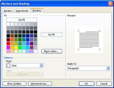
The borders and shading dialog from Word for Windows also lets you set paragraph borders.
More information about color guidelines
There are a few good resources to learn more about web accessibility requirements. For information about color contrast requirements specific to elections, check out the report put out by the National Institute of Standards and Technology.
→ Learn more about using color accessibly to meet the Web Content Accessibility Guidelines
→ Go to the NIST report, Guidelines for using color in voting systems