Usability matters – even with paper ballots
Usability matters – even with paper ballots
Think you can’t make a mistake marking your ballot? Think again. Every election, tens of thousands people cast ballots that don’t get counted because they voted for too many candidates in a contest.
We’ve been here before. Remember hanging chads? The Help America Vote Act of 2002 says that voters must be warned of these mistakes and given an opportunity to correct their ballot, to ensure that their vote counts. But even with national guidelines for ballots and voting systems, and all we know about usability, we still see ballots cast with mistakes in each election because of bad design decisions.
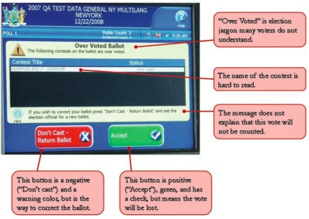
In 2010, New York State adopted new voting systems with paper ballots, in part to allow voters to check their ballots before they are cast. Most voters mark a paper ballot, and then feed it into a scanners to be counted. Sounds good, right? The scanners even display a message if a ballot has a mistake, such as too many candidates selected in a contest. Unfortunately, not only was the ballot design confusing, the message that voters in New York City saw was filled with basic design and usability errors.
- “Overvoted” is election jargon that many voters do not understand
- The name of the contest is hard to read
- The message does not explain that this vote will not be counted
- One button is a negative – “Don’t cast” – and in a warning color (red), but is the way to correct the ballot.
- The other button is positive – “Accept” – in green and has a check, but means the vote will be lost.

illustration from Design Deficiencies and Lost Votes (page 33) by Larry Norden and Sundeep Iyer, The Brennan Center for Justice Published December 5, 2011
No wonder so many people cast votes that were simply not counted.
It’s not just a few voters, either. A report from the Brennan Center for Justice, Design Deficiencies and Lost Votes (written by Lawrence Norden and Sundeep Iyer) estimate that 20,000 votes were lost in New York City (and over 60,000 votes statewide). It’s not just New York. The report documents high overvote rates – 1% or more – in Ohio, Florida, Illinois and other states.
A deeper look at the data, going down to individual precincts, shows that areas that are poor and have large numbers of racial, ethnic, and language minorities (such as recent legal immigrants) have the highest rates of lost votes. Nearly 1% of votes for governor in the Bronx were lost, with the worst problems in low-income and predominantly Hispanic area. It’s equally bad in rural communities: several counties in New York State reported overvote rates of 0.4% or more.
We can do better.
Elections are the voice of the citizens. All of us. That includes people who might be older, poorer, less educated or have a disability. Everyone deserves a ballot they understand, and a voting system that they can use accurately and confidently.
Elections — ballots, voter education, ballot scanners and ballot marking devices, signs, instructions, poll worker training – are designed. Let’s design them so that our elections are fair and accessible to all citizens.
Whitney Quesenbery and Dana Chisnell contributed to the Brennan Center’s Design Deficiencies and Lost Votes report.

