Vol. 6 Designing voter education booklets and flyers
With each election, voters receive flyers and booklets to help them understand the election process, register, find their polling places, and learn what’s on ballot for each election. But do they find the information they need?
About the research behind this Field Guide
The 10 guidelines in this Field Guide come from research with young voters and new citizens, trying to find answers in a collection of real brochures from the 2012 election.
Whitney Quesenbery and Dana Chisnell interviewed 16 new voters, asking them to look at examples of good printed voter education materials. Most of them were young and had voted for the first time in 2008 or 2012. They were men and women, black, white, and Hispanic. They included new citizens from Bolivia, Algeria, Dominican Republic, Ecuador, and Eritrea.
Printed voter education materials range from small tri-fold general information flyers to 20- page booklets with detailed election information.
We chose five that followed many best practices, to learn how to make them even better.
- VOTE! flyer – League of Women Voters Voters Guide
- San Francisco Department of Elections
- Maryland Votes – Maryland Board of Elections
- Voting in Oregon – State of Oregon
- Official Election Guide – Leon County, Florida
No. 01
Use space on the cover for useful information.
Make it easy to find out what’s inside the booklet, what elections it covers, who wrote it, and who it is for.
- Identify the elections or years the booklet covers.
- Use simple design elements make it authoritative but approachable.
- Say who takes responsibility for the information.
- Provide contact information (including social media).
No. 02
Be specific about dates and deadlines.
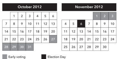
Voters want to know the actual dates to help them make sense of all the steps in an election. Show real dates for the current election, not just formulas.
Show dates and deadlines in a list, in chronological order. Or display dates in a calendar format.
Example:
2012 Presidential Election
October 27–November 3, 2012
Early voting centers open 10am to 8pm
November 6, 2012
Election Day
Example:
2012 Presidential Election
No. 03
Provide real contact information, not just a website.
People who may not have web access or email are especially likely to use printed booklets or flyers for election information.
Give voters a choice of how to contact you:
- phone numbers
- mailing or street address
- website
- social media
No. 04
Start with a roadmap.
An overview helps voters understand the scope of the information in the booklet. Without a table of contents or other roadmap, people get lost in the details.
- Help voters know what to expect: whether they vote at a polling place, a vote center or by absentee ballot.
- When voters see “Three ways to vote,” they make sure they find information about all of them.
- A table of contents also works as a map to the voting process.
No. 05
Don’t make voting look complicated (even if it is).
Show the most important or most common options first, then explain exceptions.
Keep the message simple:
- Use illustrations, maps, and diagrams that focus on one piece of information at a time.
- Eliminate unnecessary details to highlight the most important points.
- Ask and answer questions clearly
No. 06
1 page: 1 topic. (really!)
Having one topic per page makes it easier to scan through the booklet for specific topics.
Information doesn’t get buried at the end of the page.
Impatient readers miss details.
Lower literacy readers skip when they get confused.
Have good headings, in a consistent location, on every page.
No. 07
1 topic: 1 heading.
Good headings make the booklet easy to scan quickly.
It is possible to have too many headings.
Don’t put more than one topic in one heading.
Before
Voter Registration
Eligibility
Am I eligible to register to vote?
Can I register to vote if I am in the military or live overseas?
Can I register to vote if I have been convicted of a crime?
How can I determine if I qualify to have my voting rights restored following a felony conviction?
Process
When may I apply to register to vote?
After
Voter Registration
Am I eligible to register to vote?
If you are in the military or live overseas
If you have been convicted of a crime
How and when do I register to vote?
No. 08
Write headings as questions.
People read election booklets looking for answers, so it’s easy for them to recognize their questions.
Good questions show that the elections office understands what information voters need.
Across our studies, people had the same questions:
- What’s on the ballot?
- How do you vote if not on Election Day?
- How do you get an absentee ballot?
- When is your absentee ballot due?
- Where do you go to vote?
- How do you actually vote?
- Can you get a sample of the ballot?
- Are you eligible to vote?
- How do you register to vote?
- What’s the deadline for registering?
- Do you need to show your ID?
No. 09
Make sure that important information stands out.
Use icons, colored boxes, and callouts to highlight critical information that affects the ability to vote.
Illustrations of forms or actions voters must take are helpful.
Use visual design to support meaning:
- Have a consistent style.
- Choose one style of icons.
- One idea per bullet.
- Make sure colored boxes have enough contrast to be easy to read.
No. 10
Include information on how to vote.
New voters need instructions for how to mark and cast their ballot.
Current voters benefit from having the process confirmed and reinforced.
Help voters know what to expect, whether they vote at a polling place, a vote center, or by absentee ballot.
Be sure to cover:
- signing in and the poll book
- marking the ballot
- using the voting system or scanner
- returning absentee ballots


