Vol. 10 Creating forms that help voters take action
Elections are built on a foundation of forms. You know that the design of a form can make your work easier or more difficult.
And of course you want to get feedback from all of your audiences. One way to do that is to conduct surveys.
This Field Guide covers pointers on how to create forms and surveys that make it easy for people to give you the information you need.
You might also want to read these related Field Guides:
Vol. 01: Designing usable ballots
Vol. 03: Testing ballots for usability
Vol. 07: Designing election websites
No. 01
Be clear about what voters can do with the form.
Make sure the title of the form clearly reflects the purpose, from the voters’ perspective.
Give your form an active title
Use
Register to vote
Find your polling place
Avoid
Voter registration
Polling places
If a form has two purposes, make this clear.
Use
Register to vote
-OR-
Update your voter registration
See also:
Vol.05.02: Treat all communication as conversation.
No. 02
Make sure voters understand the questions.
Use simple, active, easily understood words for field labels.
Write field labels so they don’t confuse people who are reading quickly, or who don’t read well.
Before
Residence address
Voter declaration
I declare, affirm, and certify…
After
Your address
Your email
Print your name
Voter, sign here
I declare that…
The address where you receive mail
See also:
Vol.01.05: Use clear, simple language.
No. 03
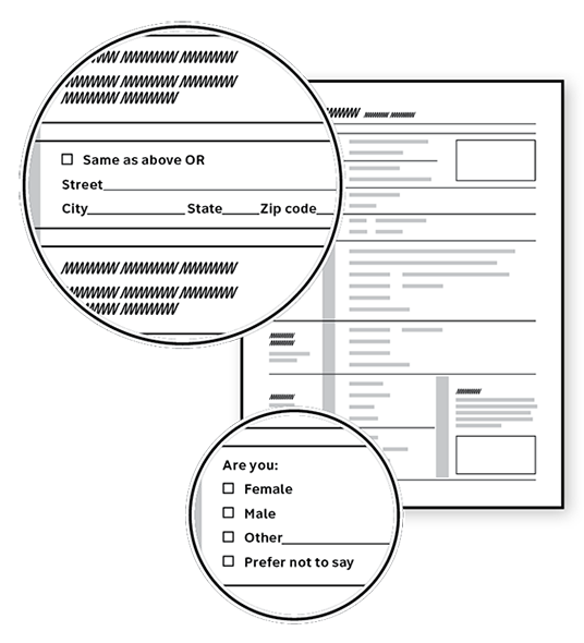
Make it possible to answer every question.
Give people a way to answer every question. They worry about leaving answers blank – even when it would be OK to do so.
Indicate required fields appropriately:
Online: mark required fields
On paper: mark optional fields
See also:
Vol.02.02: Put instructions where voters need them.
No. 04
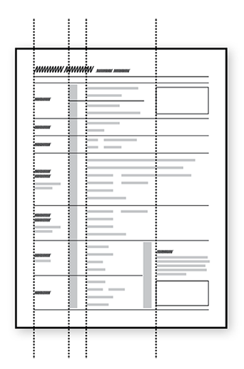
Make the layout neat and tidy.
Forms that look well-organized are easier to fill in, and give voters more confidence.
Line things up with consistent spacing and margins.
Make the form easy to use with large enough text and good contrast.
See also:
Vol.01.03: Use big enough type.
Vol.01.04: Pick one sans-serif font.
Vol.01.09: Use contrast and color to support meaning.
No. 05
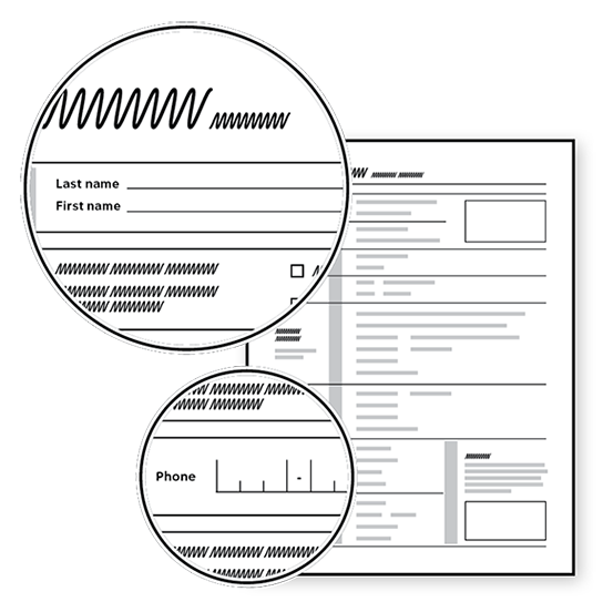
Make the space for the answer fit the format.
Make fields big enough to fit the expected answer.
Use an appropriate format for fields showing the type of answer needed.
Online, use checkboxes instead of dropdowns when possible.
No. 06
Make legal text easier to read.
Simplify when you can.
Break the clauses in declarations and affidavits into separate bullets.
Before
I HEREBY DECLARE THAT on the day of the next election I will have been a United States citizen for at least one month; will be at least 18 years of age; and am legally qualified to vote. I affirm that the information I have provided in this registration declaration is true. I understand that this registration declaration will be accepted for all purposes as the equivalent of an affidavit; and if the registration contains a materially false statement, I will be subject to penalties for perjury.
After
I declare that:
- I am a United States citizen and will have been a citizen for at least 1 month on the day of the next election.
- I will be at least 18 years old on the day of the next election.
- I live at the address in section 5.
- I am legally qualified to vote.
No. 07
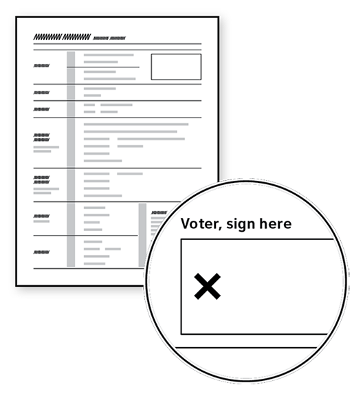
Make signature fields stand out.
Using an X to mark the location for a signature helps people get it right.
No. 08
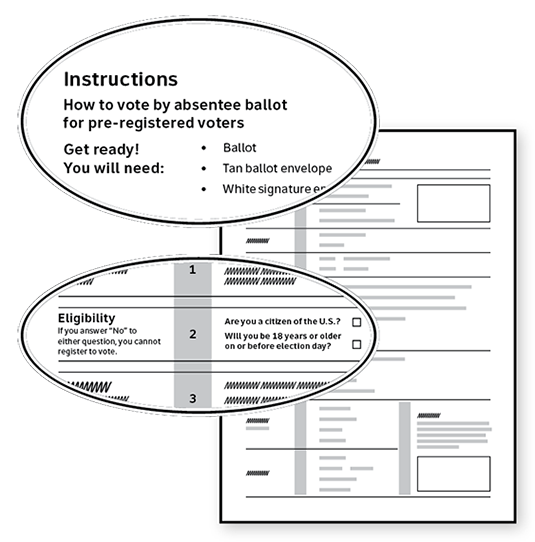
Put instructions and error messages where they will be noticed.
Start with anything the voter needs to do to prepare.
Put instructions, hints, and warnings before the field, not after.
Online, list errors at the top of the page, and highlight the location in the form.
See also:
Vol. 02.03: Include information that will prevent voters from making errors.
Vol. 04.06: Put warnings before — not after — consequences.
No. 09
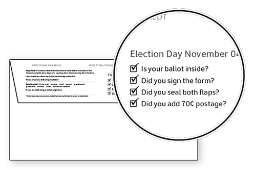
Tell voters what to do with the form when they are done.
Put the information at the end of the form, where voters will see it when they are finished filling in their information.
See also:
Vol. 01.05: Support process and navigation.
Vol. 05.03: Help voters move among media easily to get more information or take action.
No. 10
Watch people filling in the form.
Usability testing for forms includes watching to see if voters can provide all the information needed without help. Make sure voters can:
- Understand the questions
- Read the form easily
- Fill in the form without mistakes
Watch for any signs of problems:
- Making corrections
- Hesitating while filling in information
- Overfilling entries that don’t fit in the space
- Reading labels or instructions several times
- Hunting for information on or off the form
- Skipping fields or required information
- Making any mistake that would invalidate the form
See also:
Vol. 03: Testing ballots for usability

